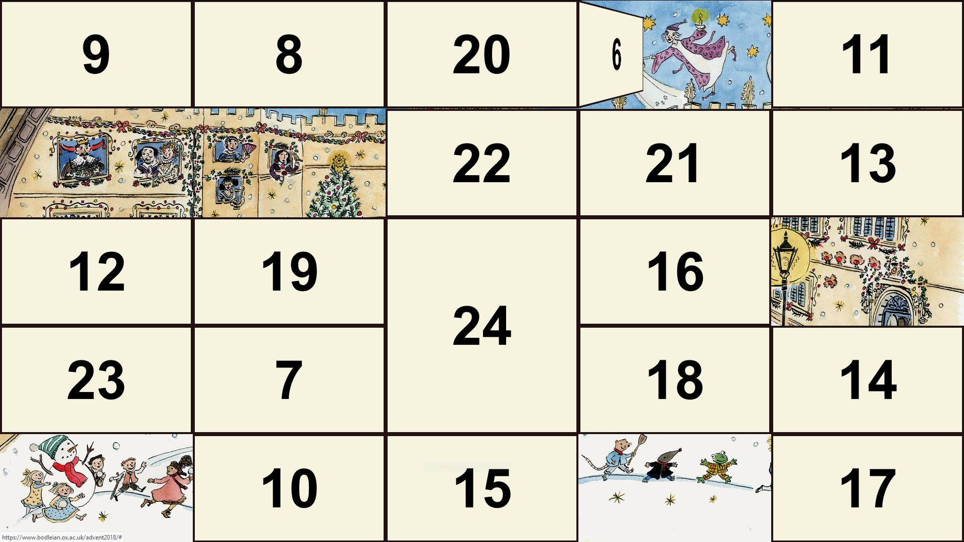
If you look closely, you’ll find I’ve shown you a sneak-peek at some of what’s behind tomorrow’s door. Shh. Don’t tell our social media officer.
As each door is opened, a different part of a (distinctly-Bodleian/Oxford) winter scene unfolds, complete with an array of fascinating characters connected to the history, tradition,
mythology and literature of the area. It’s pretty cool, and you should give it a go.
If you want to make one of your own – for next year, presumably, unless you’ve an inclination to count-down in this fashion to something else that you’re celebrating 25 days
hence – I’ve shared a version of the code that you can adapt for yourself.
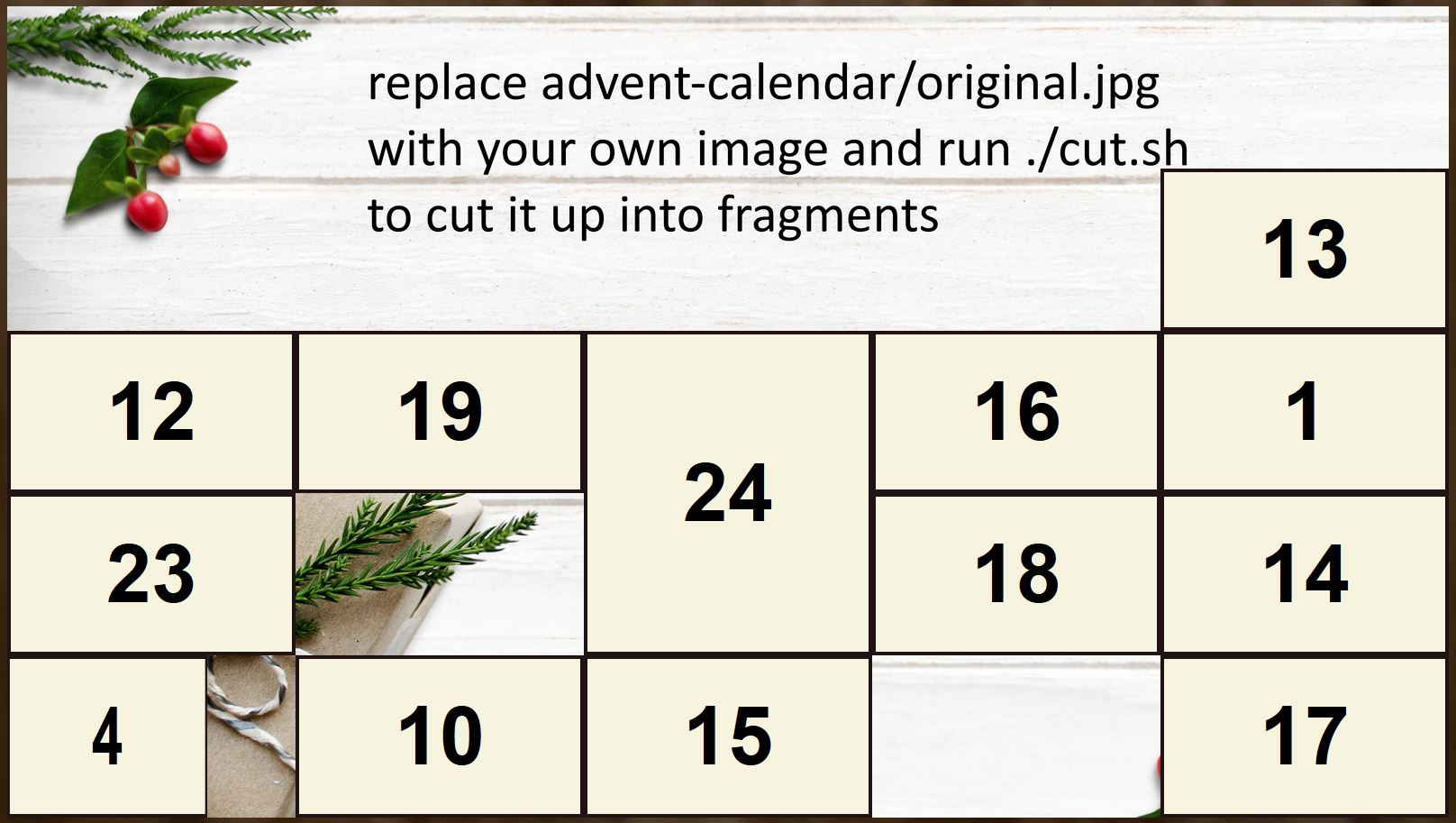
The open-source version doesn’t include the beautiful picture that the Bodleian’s does, so you’ll have to supply your own.
Features that make this implementation a good starting point if you want to make your own digital advent calendar include:
Secure: your server’s clock dictates which doors are eligible to be opened, and only content legitimately visible on a given date can be obtained (no path-traversal,
URL-guessing, or traffic inspection holes).
Responsive: calendar adapts all the way down to tiny mobiles and all the way up to 4K fullscreen along with optimised images for key resolutions.
Friendly: accepts clicks and touches, uses cookies to remember the current state so you don’t have to re-open doors you opened yesterday (unless you forgot to open
one yesterday), “just works”.
Debuggable: a password-protected debug mode makes it easy for you to test, even on a production server, without exposing the secret messages behind each door.
Expandable: lots of scope for the future, e.g. a progressive web app version that you can keep “on you” and which notifies you when a new door’s ready to be opened,
was one of the things I’d hoped to add in time for this year but didn’t quite get around to.
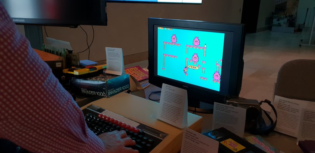
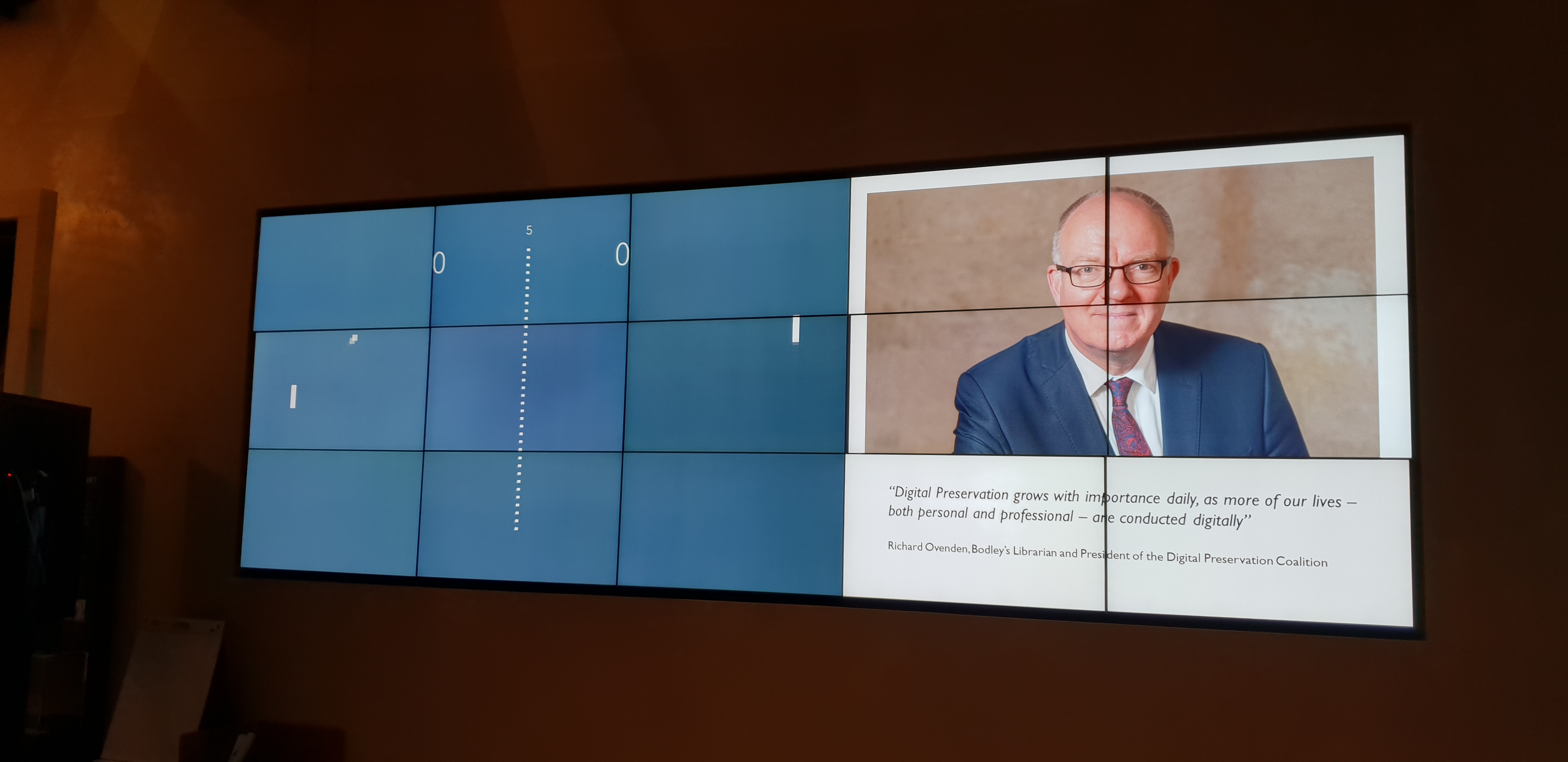
The Bodleian has a specific remit for digital archiving… but sometimes they just like collecting stuff, too, I’m sure.
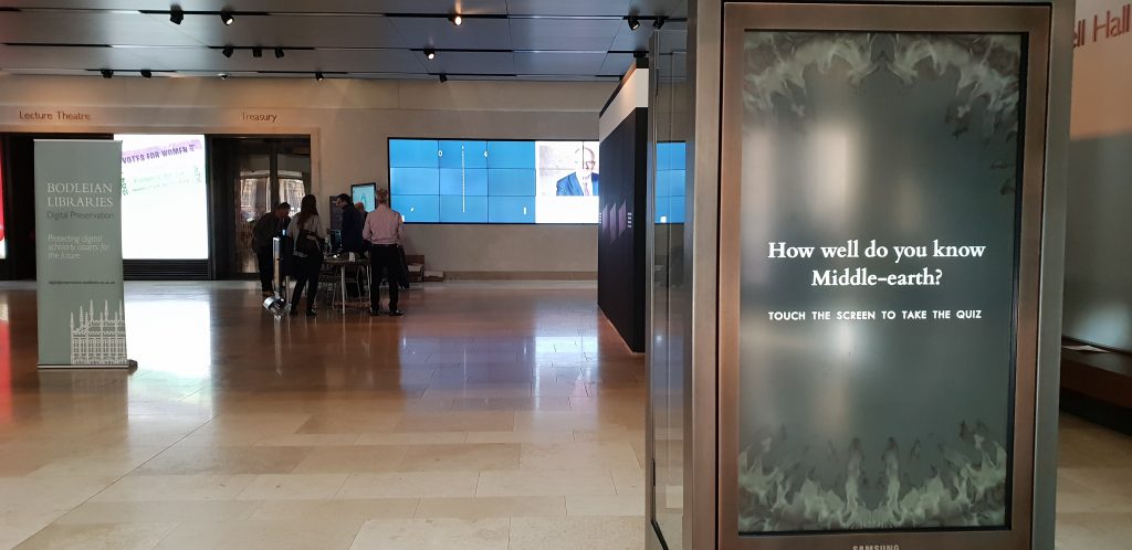
The team responsible for digital archiving had plans to spend World Digital Preservation Day running a stand in Blackwell Hall for some
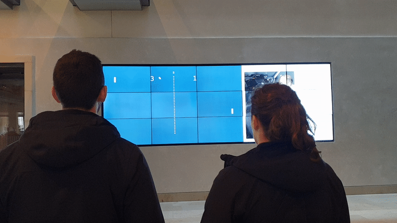
time before I got involved. They’d asked my department about using the Heritage Window – the Bodleian’s 15-screen video wall – to show a carousel of slides with relevant content over
the course of the day. Or, they added, half-jokingly, “perhaps we could have Pong up there as it’ll be its 46th birthday?”
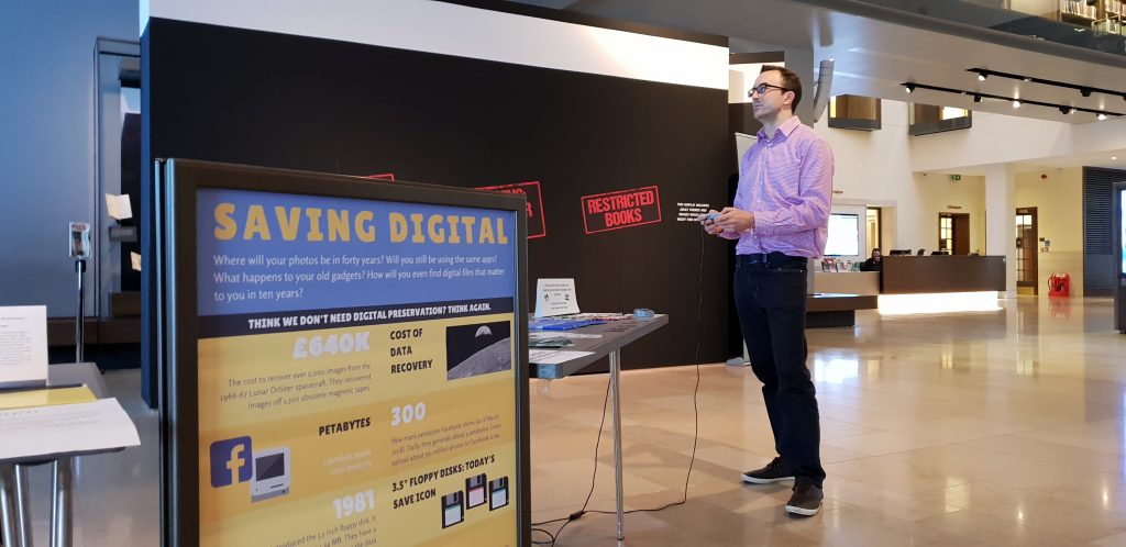
Free reign to play about with the Heritage Window while smarter people talk to the public about digital archives? Sure, sign me up.
But I didn’t take it as a joke. I took it as a challenge.
Emulating Pong is pretty easy. Emulating Pong perfectly is pretty hard. Indeed, a lot of the challenge in the preservation of (especially digital) archives in general is in
finding the best possible compromise in situations where perfect preservation is not possible. If these 8″ disks are degrading, is is acceptable to copy them onto a different medium? If this video file is unreadable in
modern devices, is it acceptable to re-encode it in a contemporary format? These are the kinds of questions that digital preservation specialists have to ask themselves all the damn
time.
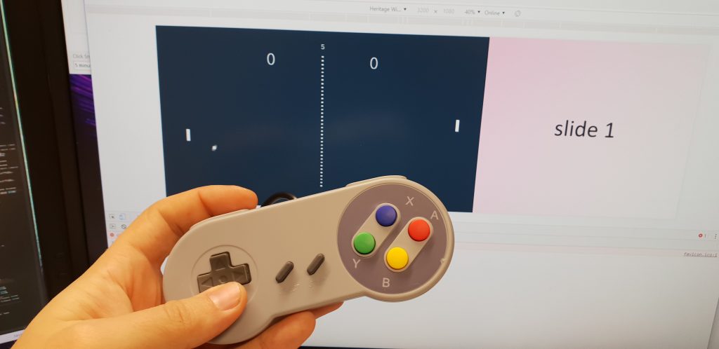
The JS Gamepad API lets your web browser talk to controller devices.
Emulating Pong in a way that would work on the Heritage Window but be true to the original raised all kinds of complications. (Original) Pong’s aspect ratio doesn’t fit nicely on a 16:9
widescreen, much less on a 27:80 ultrawide. Like most games of its era, the speed is tied to the clock rate of the processor. And of course, it should be controlled using a
“dial”.
By the time I realised that there was no way that I could thoroughly replicate the experience of the original game, I decided to take a different track. Instead, I opted to
reimplement Pong. A reimplementation could stay true to the idea of Pong but serve as a jumping-off point for discussion about how the experience of playing the game
may be superficially “like Pong” but that this still wasn’t an example of digital preservation.
Bip… boop… boop… bip… boop… bip…
Here’s the skinny:
A web page, displayed full-screen, contains both a <canvas> (for the game, sized appropriately for a 3 × 3 section of the video wall) and a
<div> full of “slides” of static content to carousel alongside (filling a 2 × 3 section).
Javascript writes to the canvas, simulates the movement of the ball and paddles, and accepts input from the JS
Gamepad API (which is awesome, by the way). If there’s only one player, a (tough! – only three people managed to beat it over the course of the day!) AI plays the other paddle.
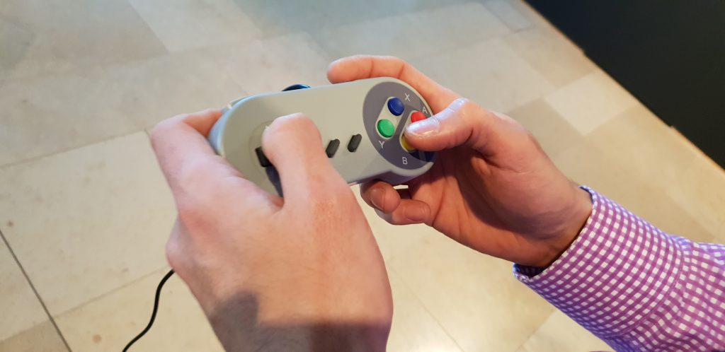
A pair of SNES controllers adapted for use as USB
controllers which I happened to own already.
Increasingly, the Bodleian’s spaces seem to be full of screens running Javascript applications I’ve written.
I felt that the day, event, and game were a success. A few dozen people played Pong and explored the other technology on display. Some got nostalgic about punch tape, huge floppy disks,
and even mechanical calculators. Many more talked to the digital archives folks and I about the challenges and importance of digital archiving. And a good time was had by all.
I’ve open-sourced the entire thing with a super-permissive license so you can deploy it yourself (you know, on your ultrawide
video wall) or adapt it as you see fit. Or if you’d just like to see it for yourself on your own computer, you can (but unless
you’re using a 4K monitor you’ll probably need to use your browser’s mobile/responsive design simulator set to 3200 × 1080 to make it fit your screen). If you don’t have
controllers attached, use W/S to control player 1 and the cursor keys for player 2 in a 2-player game.
Some days my job… isn’t like other people’s jobs. Lately, I’ve been reimplementing Pong in Javascript for the @bodleianlibs’ video wall for an event on Thursday.
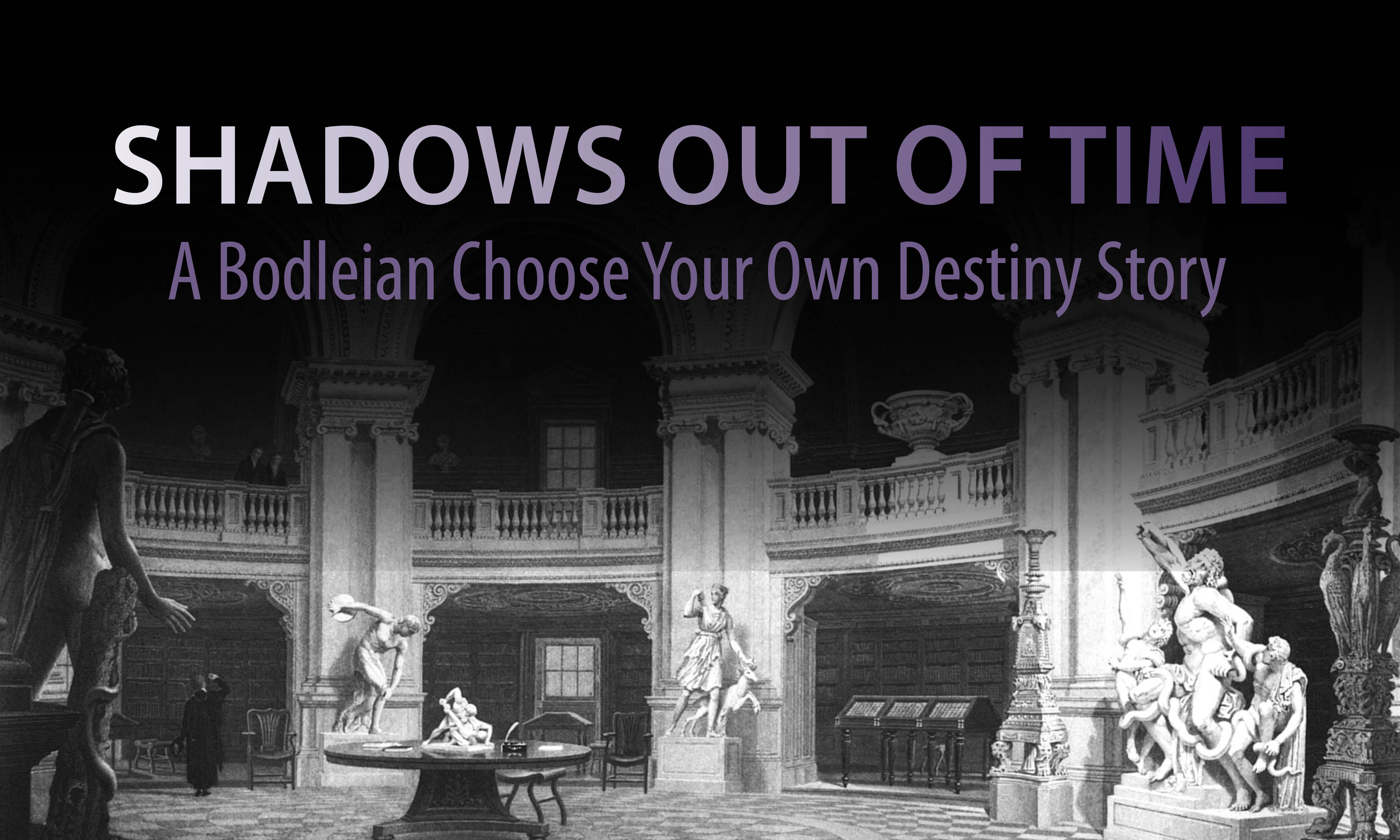
You may recall that on Halloween I mentioned that the Bodleian had released a mini choose-your-own-adventure-like adventure game book, available freely online. I decided that this didn’t go quite far
enough and I’ve adapted it into a hypertext game, below. (This was also an excuse for me to play with Chapbook, Chris Klimas‘s new under-development story format for Twine.
If the thing you were waiting for before you experienced Shadows Out of Time was it to be playable in your browser, wait no longer: click here to play the game…
Today, @bodleianlibs releases Shadows Out of Time, a Choose-Your-Own-Destiny story. It’s amazing – go read it: https://s.danq.me/Np
#halloween #InteractiveFiction
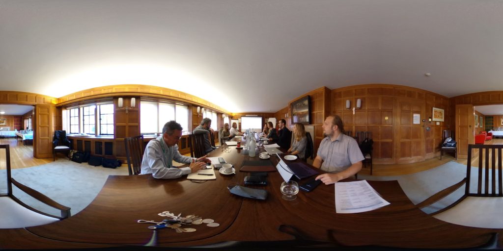
Notes from #musetech18 presentations (with a strong “collaboration” theme). Note that these are “live notes” first-and-foremost for my own use and so are probably full of typos. Sorry.
Matt Locke (StoryThings, @matlocke):
Over the last 100 years, proportional total advertising revenue has been stolen from newspapers by radio, then television: scheduled media that is experienced
simultaneously. But we see a recent drift in “patterns of attention” towards the Internet. (Schedulers, not producers, hold the power in radio/television.)
The new attention “spectrum” includes things that aren’t “20-60 minutes” (which has historically been dominated by TV) nor “1-3 hours” (which has been film), but now there are
shorter and longer forms of popular medium, from tweets and blog posts (very short) to livestreams and binging (very long). To gather the full spectrum of attention, we need to span
these spectra.
Rhythm is the traditions and patterns of how work is done in your industry, sector, platforms and supply chains. You need to understand this to be most-effective (but this is
hard to see from the inside: newcomers are helpful). In broadcast television as a medium, the schedules dictate the rhythms… in traditional print publishing, the major
book festivals and “blockbuster release” cycles dominate the rhythm.
Then how do we collaborate with organisations not in our sector (i.e. with different rhythms)? There are several approaches, but think about the rhythmic impact.
Partnered with Google Arts & Heritage; Google’s first single-partner project and also their first project with a multi-site organisation.
This kind of tech can be used to increase access (e.g. street view of closed sites) and also support curatorial/research aims (e.g. ultra-high-resolution photography).
Aside from the tech access, working with a big company like Google provides basically “free” PR. In combination, these benefits boost reach.
Learnings: prepare to work hard and fast, multi-site projects are a logistical nightmare, you will need help, stay organised and get recordkeeping/planning in place early, be aware
that there’ll be things you can’t control (e.g. off-brand PR produced by the partner), don’t be afraid to stand your ground where you know your content better.
Decide what successw looks like at the outset and with all relevant stakeholders involved, so that you can stay on course. Make sure the project is integrated into contributors’
work streams.
Daria Cybulska (Wikimedia UK, @DCybulska):
Collaborative work via Wikimedians-in-residence not only provides a boost to open content but involves engagement with staff and opens further partnership opportunities.
Your audience is already using Wikipedia: reaching out via Wikipedia provides new ways to engage with them – see it as a medium as well as a platform.
Wikimedians-in-residence, being “external”, are great motivators to agitate processes and promote healthy change in your organisation.
Creative Collaborations ([1] Kate Noble @kateinoble, Ina Pruegel @3today, [2] Joanna Salter, [3] Michal Cudrnak, Johnathan Prior):
Digital making (learning about technology through making with it) can link museums with “maker culture”. Cambridge museums (Zoology, Fitzwilliam) used a “Maker in Residence”
programme and promoted “family workshops” and worked with primary schools. Staff learned-as-they-went and delivered training that they’d just done themselves (which fits maker culture
thinking). Unexpected outcomes included interest from staff and discovery of “hidden” resources around the museums, and the provision of valuable role models to participants. Tips: find
allies, be ambitious and playful, and take risks.
National Maritime Museum Greenwich/National Maritime Museum – “re.think” aimed to engage public with emotive topics and physically-interactive exhibits. Digital wing allowed leaving
of connections/memories, voting on hot issues, etc. This leads to a model in which visitors are actively engaged in shaping the future display (and interpretation) of exhibitions.
Stefanie Posavec appointed as a data artist in residence.
SoundWalk Strazky at Slovak National Gallery: audio-geography soundwalks as an immersive experiential exhibition; can be done relatively cheaply, at the basic end. Telling fictional
stories (based on reality) can help engage visitors with content (in this case, recreating scenes from artists’ lives). Interlingual challenges. Delivery via Phonegap app which provides
map and audio at “spots”; with a simple design that discourages staring-at-the-screen (only use digital to improve access to content!).
Lightning talks:
Maritime Museum Greenwich: wanted to find out how people engage with objects – we added both a museum interpretation and a community message to each object. Highly-observational
testing helped see how hundreds of people engage with content. Lesson: curators are not good judges of how their stuff will be received; audience ownership is amazing. Be reactive.
Visitors don’t mind being testers of super-rough paper-based designs.
Nordic Museum / Swedish National Heritage Board explored Generous Interfaces: show first, don’t ask, rich overviews, interobject relationships, encourage exploration etc. (Whitelaw,
2012). Open data + open source + design sprints (with coding in between) + lots of testing = a collaborative process. Use testing to decide between sorting OR filtering;
not both! As a bonus, generous interfaces encourage finding of data errors. bit.ly/2CNsNna
IWM on the centenary of WWI: thinking about continuing the crowdsourcing begun by the IWM’s original mission. Millions of assets have been created by users. Highly-collaborative
mechanism to explore, contribute to, and share a data space.
Lauren Bassam (@lswbassam) on LGBT History and co-opting of Instagram as an archival space: Instagram is an unconventional archival source, but provides a few benefits in
collaboration and engagement management, and serves as a viable platform for stories that are hard to tell using the collections in conventional archives. A suitably-engaged community
can take pride in their accuracy and their research cred, whether or not you strictly approve of their use of the term “archivist”. With closed stacks, we sometimes forget how important
engagement, touch, exploration and play can be.
Owen Gower (@owentg) from Dr. Jenner’s House Museum and Garden: they received EU REVEAL funding to look at VR as an engagement tool. Their game is for PSVR and has a commercial
release. The objects that interested the game designers the most weren’t necessarily those which the curators might have chosen. Don’t let your designers get carried away and fill the
game with e.g. zombies. But work with them, and your designers can help you find not only new ways to tell stories, but new stories you didn’t know you could
tell. Don’t be afraid to use cheap/student developers!
Rebecca Kahm @rebamex from Pelagios Commons (@Pelagiosproject): the problem with linked data is that it’s hard to show its value to end users (or even show museums “what you can do”
with it). Coins have great linked data, in collections. Peripleo was used to implement a sort-of “reverse Indiana Jones”: players try to recover information to find where an
artefact belongs.
Jon Pratty: There are lots of useful services (Flickr, Storify etc.) and many are free (which is great)… but this produces problems for us in terms of the long-term
life of our online content, not to mention the ethical issues with using services whose business model is built on trading personal data of our users. [Editor’s note: everything being
talked about here is the stuff that the Indieweb movement have been working on for some time!] We need to de-siloise and de-centralise our content
and services. redecentralize.org? responsibledata.io?
In-House Collaboration and the State of the Sector:
Rosie Cardiff @RosieCardiff, Serpentine Galleries on Mobile Tours. Delivered as web application via captive WiFi hotspot. Technical challenges were significant for a relatively
small digital team, and there was some apprehension among frontline staff. As a result of these and other problems, the mobile tours were underused. Ideas to overcome barriers: report
successes and feedback, reuse content cross-channel, fix bugs ASAP, invite dialogue. Interesting that they’ve gained a print guides off the back of the the digital. Learn lessons and
relaunch.
Sarah Younaf @sarahyounas, Tyne & Wear Museums. Digital’s job is to ask the questions the museum wouldn’t normally ask, i.e. experimentation (with a human-centric bias). Digital is
quietly, by its nature, “given permission” to take risks. Consider establishing relationships with (and inviting-in) people who will/want to do “mashups” or find alternative uses for
your content; get those conversations going about collections access. Experimental Try-New-Things afternoons had value but this didn’t directly translate into ideas-from-the-bottom,
perhaps as a result of a lack of confidence, a requirement for fully-formed ideas, or a heavy form in the application process for investment in new initiatives. Remember you can’t
change everyone, but find champions and encourage participation!
Kati Price @katiprice on Structuring for Digital Success in GLAM. Study showed that technical leadership and digital management/analysis is rated as vital, yet they’re also
underrepresented. Ambitions routinely outstrip budgets. Assumptions about what digital teams “look” like from an org-chart perspective don’t cover the full diversity: digital teams look
very different from one another! Forrester Research model of Digital Maturity seems to be the closest measure of digital maturity in GLAM institutions, but has flaws (mostly relating to
its focus in the commercial sector): what’s interesting is that digital maturity seems to correlate to structure – decentralised less mature than centralised less mature than
hub-and-spoke less mature than holistic.
Jennifer Wexler, Daniel Pett, Chiara Bonacchi on Diversifying Museum Audiences through Participation and stuff. Crowdsourcing boring data entry tasks is sometimes easier than asking
staff to do it, amazingly. For success, make sure you get institutional buy-in and get press on board. Also: make sure that the resulting data is open so everybody can
explore it. Crowdsourcing is not implicitly democratisating, but it leads to the production of data that can be. 3D prints (made from 3D cutouts generated by crowdsourcing) are a useful
accessibility feature for bringing a collection to blind or partially-sighted visitors, for example. Think about your audiences: kids might love your hip VR, but if their parents hate
it then you still need a way to engage with them!
Implemented a demonstrative XSS payload targetting a CMS (as a
teaching tool, to demonstrate how a series of minor security vulnerabilities can cascade into one huge one).
Gotten my ‘flu jab.
Not every day is like this. But sometimes, just sometimes, one can be.
Earlier this year I found a mystery cable. But today, I’ve got an even bigger mystery. What the hell is this?
It’s a… thing?
I found it in a meeting room at work, tucked away in a corner. Aside from the power cord, there are no obvious interfaces to it.
There are two keyhole-shaped “buttons” which can be pressed down about 2cm and which spring back up (except when they jam, but I think they’re not supposed to).
My best bet is that it’s some kind of induction-based charger? I imagine some kind of device like a radio microphone or walkie-talkie that can be pushed-in to these holes and the button
“spring” is just about closing the hole when it’s not in use. But the box is old, based on the style of plug, cable, and general griminess of the hardware… not to mention that
it’s got a stack of PAT test stickers going back at least 11 years.
No real markings anywhere on it: there’s a small hole in the (metal) base and PAT test stickers.
I’ve plugged it in and tried “pressing” the buttons but it doesn’t appear to do anything, which supports my “induction charger” hypothesis. But what does it charge? I must
know!
Edit:The only Electrak I can find make lighting control systems. Could it be
something to do with lighting control? I can’t find anything that looks like this on their website, though.
The plugs apparently look something like this, although I can’t find any here.
Edit 3: Hang on a minute… the most-recent PAT test sticker indicates that it was tested in… November 2019. Now my working hypothesis is that this is some kind
of power supply system for a time machine we haven’t yet built. I’ve asked a number of colleagues what it’s for (i.e. what plugs into it) and nobody seems to have a clue.
The OpenStreetMap project consists of raw map data, collected and aggregated by thousands of users. This tutorial covers the configuration and maintenance of a web service using
Open Source Routing Machine (OSRM), which is based on the OpenStreetMap d
The OpenStreetMap project consists of raw map data, collected and aggregated by thousands of users. However, its open access policy
sparked a number of collateral projects, which collectively cover many of the features typically offered by commercial mapping services.
The most obvious advantage in using OpenStreetMap-based software over a commercial solution is economical convenience, because OpenStreetMap comes as free (both as in beer and as in
speech) software. The downside is that it takes a little configuration in order to setup a working web service.
This tutorial covers the configuration and maintenance of a web service which can answer questions such as:
What is the closest street to a given pair of coordinates?
What’s the best way to get from point A to point B?
How long does it take to get from point A to point B with a car, or by foot?
The software that makes this possible is an open-source project called Open Source Routing Machine (OSRM), which is based on the OpenStreetMap
data. Functionalities to embed OpenStreetMaps in Web pages are already provided out-of-the-box by APIs such as OpenLayers.
…
While slightly dated, I found this guide to be really valuable in my effort to set up a server that could spit out fastest walking routes around Oxford to support a PWA-driven tour of places relevant to J. R. R. Tolkien’s life, at my “day job”.
Tower of the Five Orders, Oxford OX1 3BW, United Kingdom.
Rating: ⭐⭐⭐⭐⭐
This iconic Oxford landmark is named for the architectural characteristics of each of its five floors. Each exhibits a different order – or “style” – of classical architecture: from
bottom to top – tuscan, doric, ionic, corinthian and composite. Part of the joy of “discovering” the tower, visiting as a tourist, comes from the fact that despite it’s size it’s
unlikely to be the first thing you see as you enter the quad: coming in from the Great Gate, for example, it won’t be until you turn around and look up that you see it… and even at a
glance you won’t necessarily observe its unusual architecture unless you’ve been told to look specifically at the columns.
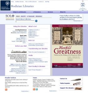
When I first started working at the Bodleian Libraries in 2011, their websites were looking… a little
dated. I’d soon spend some time working with a vendor (whose premises mysteriously caught fire while I was there, freeing me up to spend my
birthday in a bar) to develop a fresh, modern interface for our websites that, while not the be-all and end-all, was a huge leap forwards and has served us well for the last five years
or so.
The colour scheme, the layout, the fact that it didn’t remotely work on mobiles… there was a lot wrong with the old design of the Bodleian Libraries’ websites.
Fast-forward a little: in about 2015 we noticed a few strange anomalies in our Google Analytics data. For some reason, web addresses were appearing that didn’t exist anywhere on our
site! Most of these resulted from web visitors in Turkey, so we figured that some Turkish website had probably accidentally put our Google Analytics user ID number into their
code rather than their own. We filtered out the erroneous data – there wasn’t much of it; the other website was clearly significantly less-popular than ours – and carried on. Sometimes
we’d speculate about the identity of the other site, but mostly we didn’t even think about it.
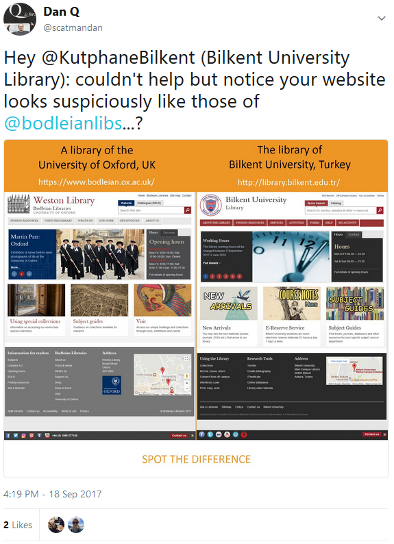
How a Bodleian Libraries’ website might appear today. Pay attention, now: there’ll be a spot-the-difference competition in a moment.
Earlier this year, there was a spike in the volume of the traffic we were having to filter-out, so I took the time to investigate more-thoroughly. I determined that the offending
website belonged to the Library of Bilkent University, Turkey. I figured that some junior web developer there must have copy-pasted the
Bodleian’s Google Analytics code and forgotten to change the user ID, so I went to the website to take a look… but I was in for an even bigger surprise.
Hey, that looks… basically identical!
Whoah! The web design of a British university was completely ripped-off by a Turkish university! Mouth agape at the audacity, I clicked my way through several of their pages to try to
understand what had happened. It seemed inconceivable that it could be a coincidence, but perhaps it was supposed to be more of an homage than a copy-paste job? Or perhaps they
were ripped-off by an unscrupulous web designer? Or maybe it was somebody on the “inside”, like our vendor, acting unethically by re-selling the same custom design? I didn’t believe it
could be any of those things, but I had to be sure. So I started digging…
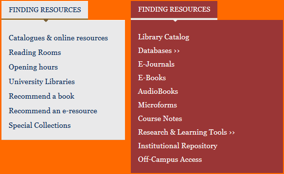
Our user research did indicate that putting the site and catalogue search tools like this was smart. Maybe they did the same research?
Menus are pretty common on many websites. They probably just had a similar idea.
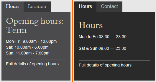
Tabs are a great way to show opening hours. Everybody knows that. And this is obviously just the a popular font.
Oh, you’ve got a slider too. With circles? And you’ve got an identical Javascript bug? Okay… now that’s a bit of a coincidence…
Okay, I’m getting a mite suspicious now. Surely we didn’t independently come up with this particular bit of design?
Well these are clearly different. Ours has a copyright notice, for example…
Oh, you DO have a copyright notice. Hang on, wait: you’ve not only stolen our design but you’ve declared it to be open-source???
I was almost flattered as I played this spot-the-difference competition, until I saw the copyright notice: stealing our design was galling enough, but then relicensing it in such a way
that they specifically encourage others to steal it too was another step entirely. Remember that we’re talking about an academic library, here: if anybody ought to
have a handle on copyright law then it’s a library!
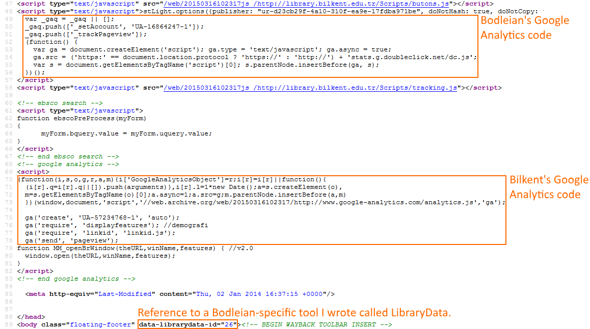
I took a dive into the source code to see if this really was, as it appeared to be, a copy-paste-and-change-the-name job (rather than “merely” a rip-off of the entire graphic design),
and, sure enough…
In their HTML source code, you can see both the Bodleian’s Google Analytics code (which they failed to remove) but also their own. And a data- attribute related to a project I wrote
and that means nothing to their site.
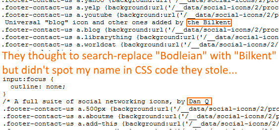
It looks like they’d just mirrored the site and done a search-and-replace for “Bodleian”, replacing it with “Bilkent”. Even the code’s spelling errors, comments, and indentation were
intact. The CSS was especially telling (as well as being chock-full of redundant code relating to things that appear on our website but not on theirs)…
The search-replace resulted in some icky grammar, like “the Bilkent” appearing in their code. And what’s this? That’s MY NAME in the middle of their source code!
So I reached out to them with a tweet:
My first tweet to Bilkent University Library contained a “spot the difference” competition.
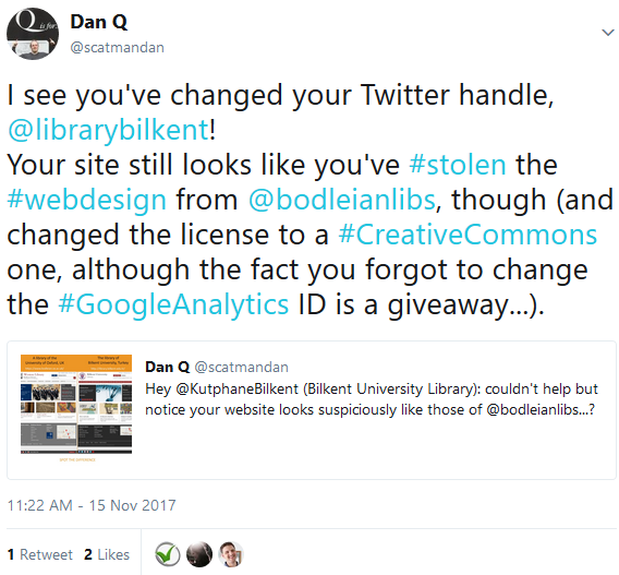
I didn’t get any response, although I did attract a handful of Turkish followers on Twitter. Later, they changed their Twitter handle and I thought I’d take advantage of the then-new
capability for longer tweets to have another go at getting their attention:
This time, I was a little less-sarcastic and a little more-aggressive. Turns out that’s all that was needed.
Clearly this was what it took to make the difference. I received an email from the personal email account of somebody claiming to be Taner
Korkmaz, Systems Librarian with Bilkent’s Technical Services team. He wrote (emphasis mine):
Dear Mr. Dan Q,
My name is Taner Korkmaz and I am the systems librarian at Bilkent. I am writing on behalf of Bilkent University Library, regarding your share about Bilkent on
your Twitter account.
Firstly, I would like to explain that there is no any relation between your tweet and our library Twitter handle change. The librarian who is Twitter admin at Bilkent did not notice
your first tweet. Another librarian took this job and decided to change the twitter handle because of the Turkish letters, abbreviations, English name requirement etc. The first name
was @KutphaneBilkent (kutuphane means library in Turkish) which is not clear and not easy to understand. Now, it is @LibraryBilkent.
About 4 years ago, we decided to change our library website, (and therefore) we reviewed the appearance and utility of the web pages.
We appreciated the simplicity and clarity of the user interface of University of Oxford Bodlien Library & Radcliffe Camera, as an academic pioneer in many fields. As a not profit institution, we took advantage of your template by using CSS and HTML, and added our own original content.
We thought it would not create a problem the idea of using CSS codes since on the web page there isn’t any license notice or any restriction related to
the content of the template, and since the licenses on the web pages are mainly more about content rather than templates.
The Library has its own Google Analytics and Search Console accounts and the related integrations for the web site statistical data tracking. We would like to point out that there is
a misunderstanding regarding this issue.
In 2017, we started to work on creating a new web page and we will renew our current web page very soon.
Thank you in advance for your attention to this matter and apologies for possible inconveniences.
Yours sincerely,
Or to put it another way: they decided that our copyright notice only applied to our content and not our design and took a copy of the latter.
Do you remember when I pointed out earlier that librarians should be expected to know their way around copyright law? Sigh.
They’ve now started removing evidence of their copy-pasting such as the duplicate Google Analytics code fragment and the references to LibraryData, but you can still find the unmodified
code via archive.org, if you like.
That probably ends my part in this little adventure, but I’ve passed everything on to the University of Oxford’s legal team in case any of them have anything to say about it. And now
I’ve got a new story to tell where web developers get together over a pint: the story of the time that I made a website for a university… and a different university stole it!