My evening just freed up, so – weather-permitting – I might brave the sleet and cold and cycle out to this hashpoint this evening.
Expedition
Our dog had surgery at the start of the week and has now recovered enough to want a short walk, so I changed my plan to cycle for one to drive (with the dog) out to somewhere near the
hashpoint and take her for a walk to and around it. Amazingly, I might have been faster to cycle: a crash on the A40 had lead to lots of traffic being re-routed along the exact same
back roads that was to be my most-direct route, and on the local rat run through South Leigh I got trapped behind a line of folks who weren’t familiar with this particular unlit and
twisty road and took the entire derestricted section at an average of 25mph. Ah well.
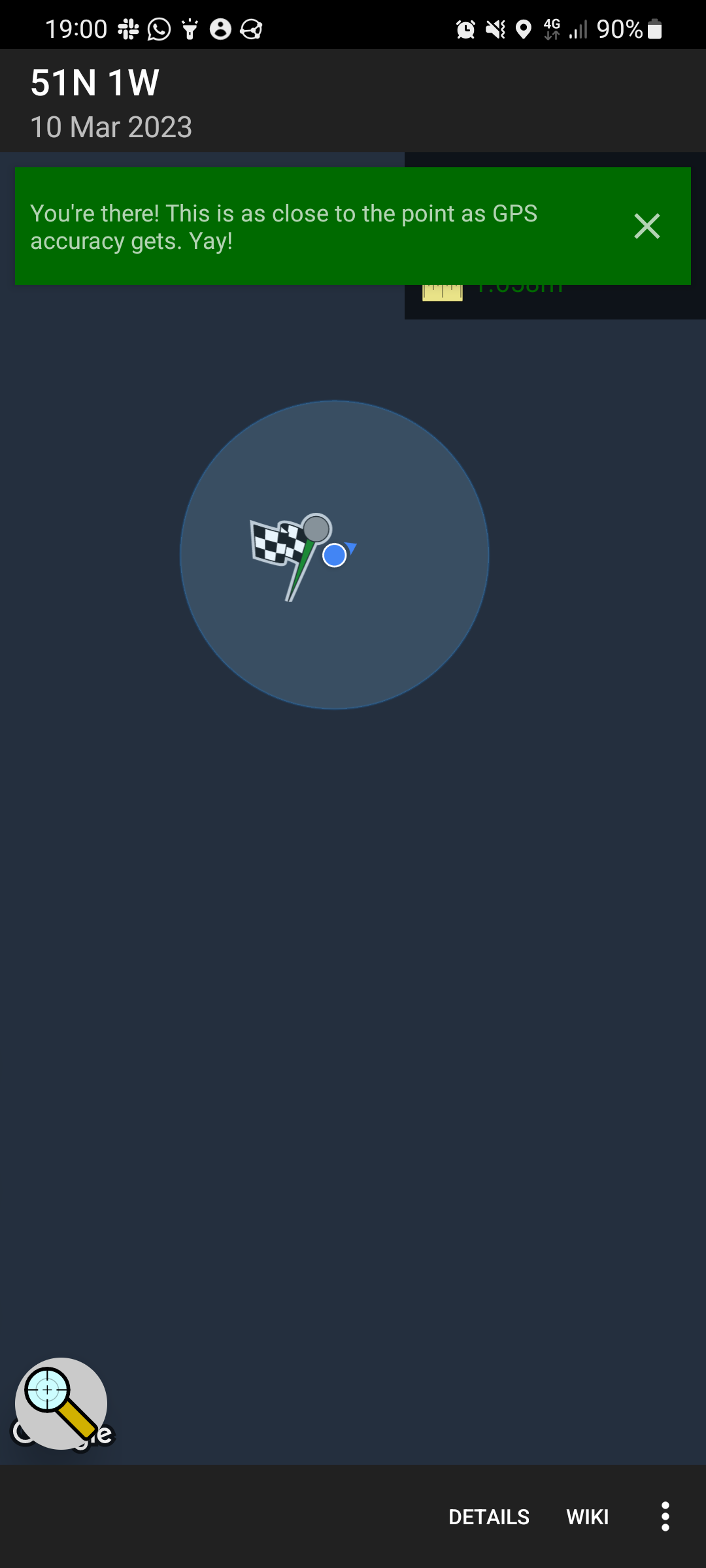
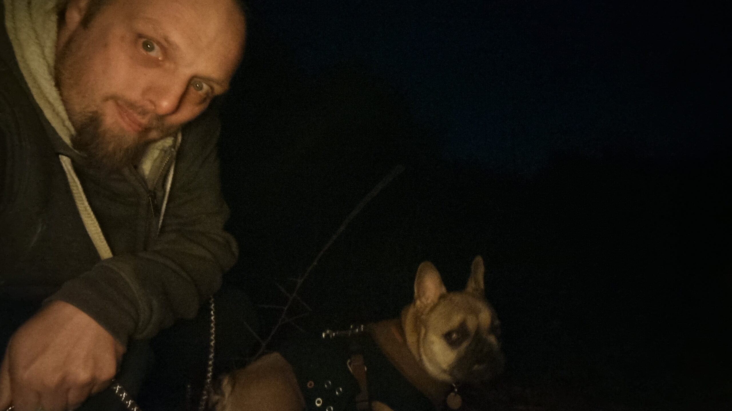
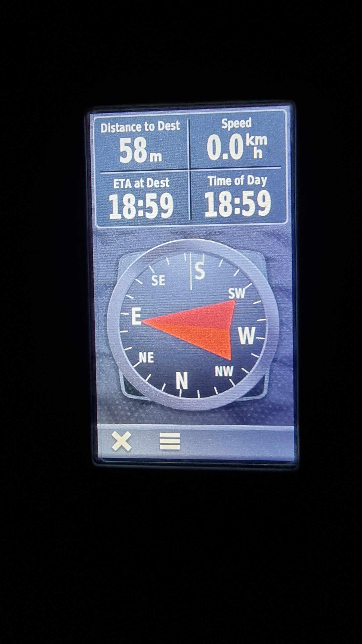
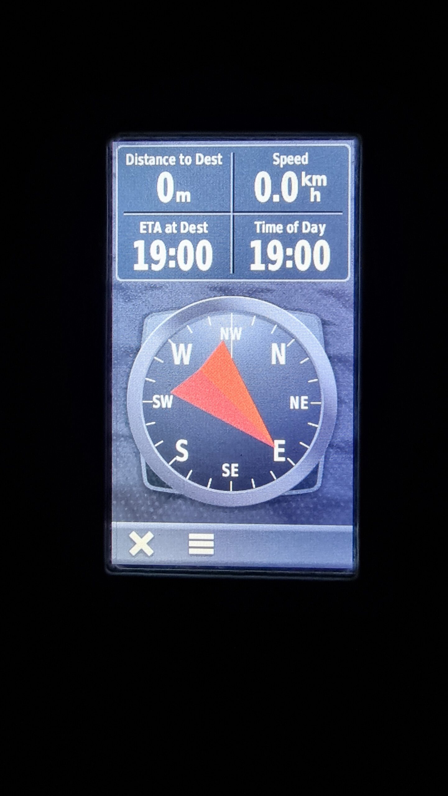
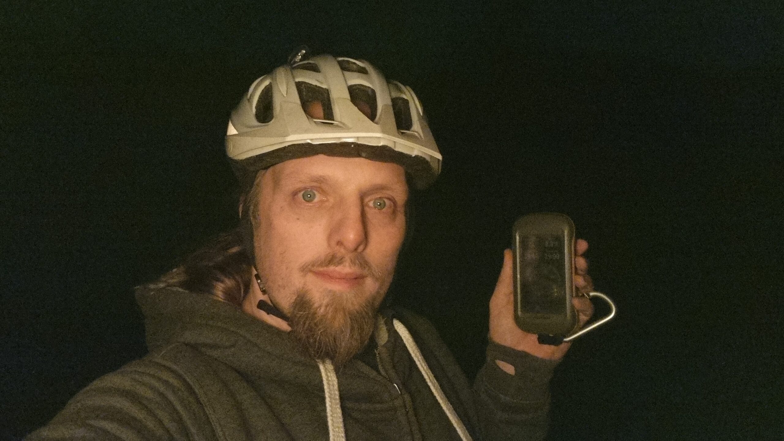
Out of laziness, I didn’t bring my GPSr or make a tracklog; I just used the Geohashdroid app and took a screenshot when I got there. South Leigh Common is pleasant, but it was dark, and
my photos are all a little bit hard to make out! But the stars were beautiful tonight, and the dog loved one of her first outings since her surgery and enjoying running around in the
long wet grass and sticking her head into rabbit holes. At 19:00 precisely I got within about a metre and a half of the hashpoint – well within the circle of uncertainty – and turned to
head home.
I also took the time while there to update OpenStreetMap by drawing in the
boundaries of the common, replacing the nondescript “point” that had marked it before.
Photos
Proof from Geohashdroid
Silly grins in the dark from a man and his dog
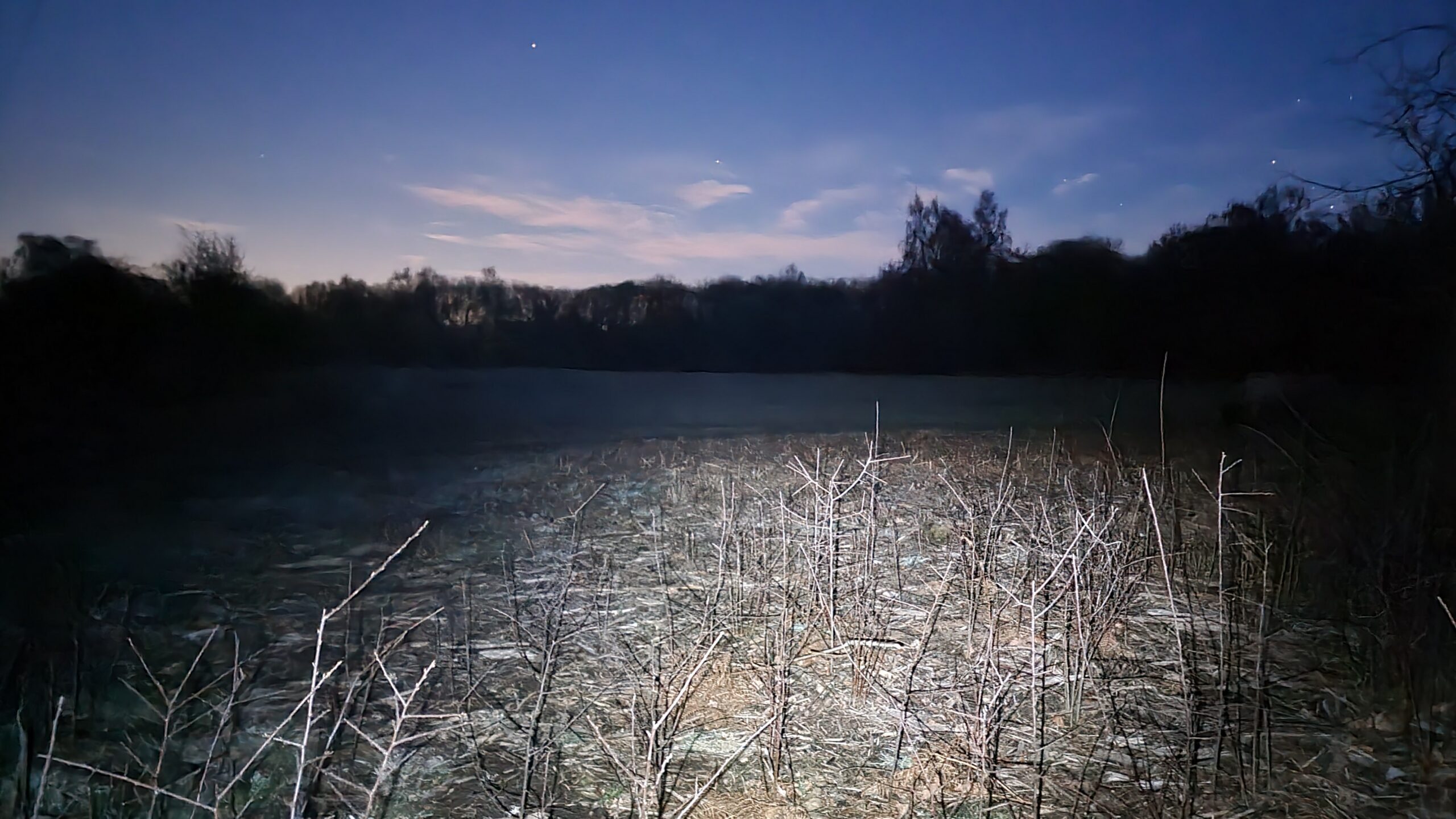
Long exposure, with flashlight on, showing the hashpoint and the Common beyond
When I saw this hashpoint appear I thought to myself: that’s eminently achievable! I hoped I might be able to slip away from work for a lunchtime cycle to claim it.
But the gods of technology didn’t approve of my plan and turned my workday into a catastrophe of the kind that only a computer can, and the chance of taking a long lunch evaporated
quickly. But fortune dealt me a second hand when the weather held off into the evening, and I instead opted for a post-dinner huckle in the dark out to this hashpoint.
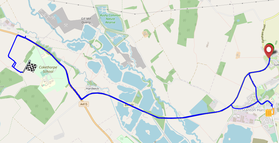
I set out around 18:30, South through Stanton Harcourt then North up the adorably-named Ducklington Road. It took some time to sight the somewhat-concealed bridleway around the hill of
Cokethorpe School. And then, another challenge – navigating by OpenStreetMap I missed my turning and went straight through a farmyard, and had to carry my bike over a fence at the other
end. Turns out the map is wrong and I later found a sign indicating the true course of the bridleway; I’ll get that corrected.
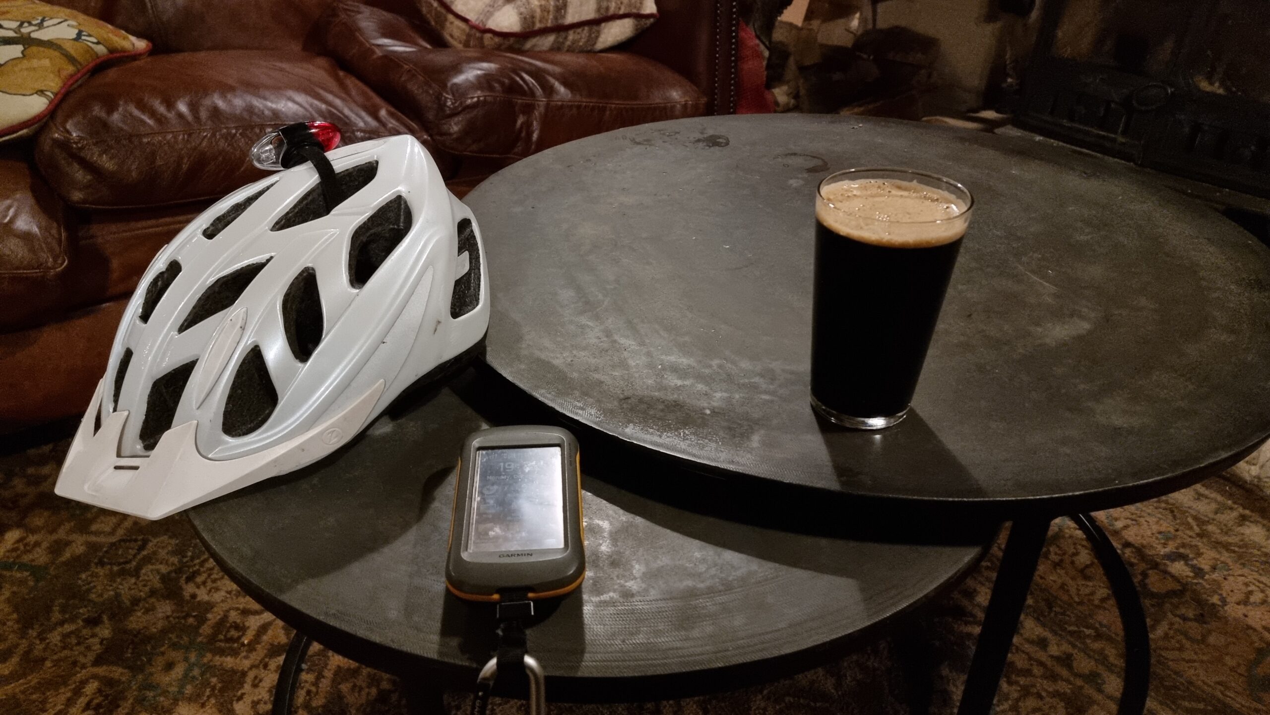
I abandoned my bike for the final 50 metres, trekking through the thick grass of an unmown meadow to the hashpoint and arriving around 19:00. No panoramic photo today it’s too dark –
but you get a silly grin.
Pleased with this fast expedition, I diverted on my route home to the Harcourt Arms pub for a pint of their surprisingly-delicious
seasonal guest ale, Fairytale of Brew York, which genuinely tastes like stollen. There, I wrote up this
expedition report, but I’ll have to get home before I can extract my GPSr‘s tracklog.
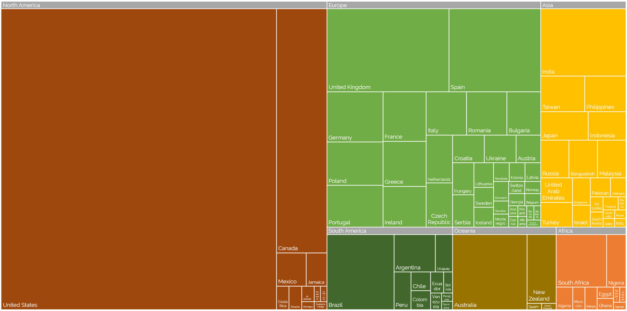
Off the back of my recent post about privileges I enjoy as a result of my location and first language, even at my highly-multinational employer, and inspired by my colleague Atanas‘ data-mining into where Automatticians are
located, I decided to do another treemap, this time about which countries Automatticians call home:
Where are the Automatticians?
If raw data’s your thing (or if you’re just struggling to make out the names of the countries with fewer Automatticians), here’s
a CSV file for you.
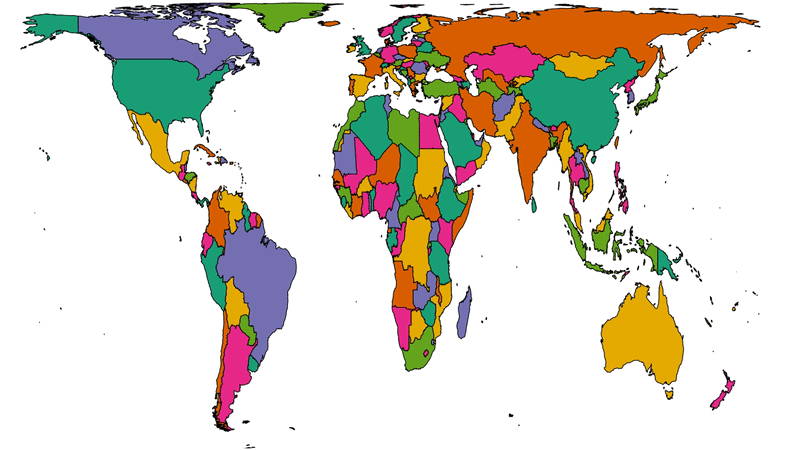
To get a better picture of that, let’s plot a couple of cartograms. This animation cycles between showing countries at (a) their
actual (landmass) size and (b) approximately proportional to the number of Automatticians based in each country:
This animation alternates between showing countries at “actual size” and proportional to the number of Automatticians based there. North America and Europe dominate the map, but there
are other quirks too: look at e.g. how South Africa, New Zealand and India balloon.
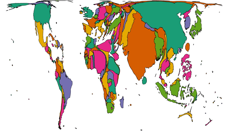
Another way to consider the data would be be comparing (a) the population of each country to (b) the number of Automatticians there. Let’s try that:
Here we see countries proportional to their relative population change shape to show number of Automatticians, as seen before. Notice how countries with larger populations like China
shrink away to nothing while those with comparatively lower population density like Australia blow up.
There’s definitely something to learn from these maps about the cultural impact of our employee diversity, but I can’t say more about that right now… primarily because I’m not smart
enough, but also at least in part because I’ve watched the map animations for too long and made myself seasick.
A note on methodology
A few quick notes on methodology, for the nerds out there who’ll want to argue with me:
Country data was extracted directly from Automattic’s internal staff directory today and is based on self-declaration by employees (this is relevant because we employ a relatively
high number of “digital nomads”, some of whom might not consider any one country their home).
Countries were mapped to continents using this dataset.
Maps are scaled using Robinson projection. Take your arguments about this over here.
The treemaps were made using Excel. The cartographs were produced based on work by Gastner MT, Seguy V, More P. [Fast flow-based algorithm for creating density-equalizing map
projections. Proc Natl Acad Sci USA 115(10):E2156–E2164 (2018)].
Some countries have multiple names or varied name spellings and I tried to detect these and line-up the data right but apologies if I made a mess of it and missed yours.
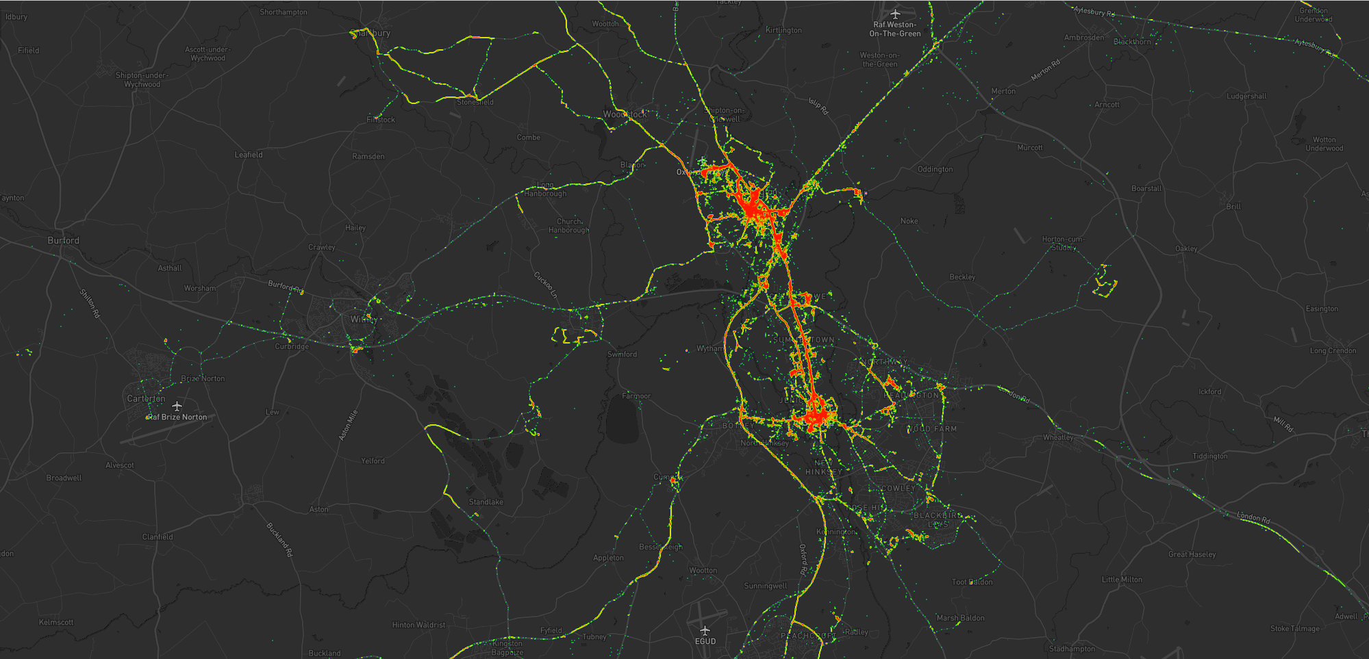
As I mentioned last year, for several years I’ve collected pretty complete historic location data from GPSr devices I carry with me everywhere, which I collate in a personal μlogger server.
Going back further, I’ve got somewhat-spotty data going back a decade, thanks mostly to the fact that I didn’t get around to opting-out of Google’s location tracking until only a few years ago (this data is now
also housed in μlogger). More-recently, I now also get tracklogs from my smartwatch, so I’m managing to collate more personal
location data than ever before.
The blob around my house, plus some of the most common routes I take to e.g. walk or cycle the children to school.
A handful of my favourite local walking and cycling routes, some of which stand out very well: e.g. the “loop” just below the big blob represents a walk around the lake at Dix Pit;
the blob on its right is the Devils Quoits, a stone circle and henge that I thought were sufficiently interesting that
I made a virtual geocache out of them.
The most common highways I spend time on: two roads into Witney, the road into and around Eynsham, and routes to places in Woodstock and North Oxford where the kids have often had
classes/activities.
I’ve unsurprisingly spent very little time in Oxford City Centre, but when I have it’s most often been at the Westgate Shopping Centre,
on the roof of which is one of the kids’ favourite restaurants (and which we’ve been able to go to again as Covid restrictions have lifted, not least thanks to their outdoor seating!).
One to eight years ago
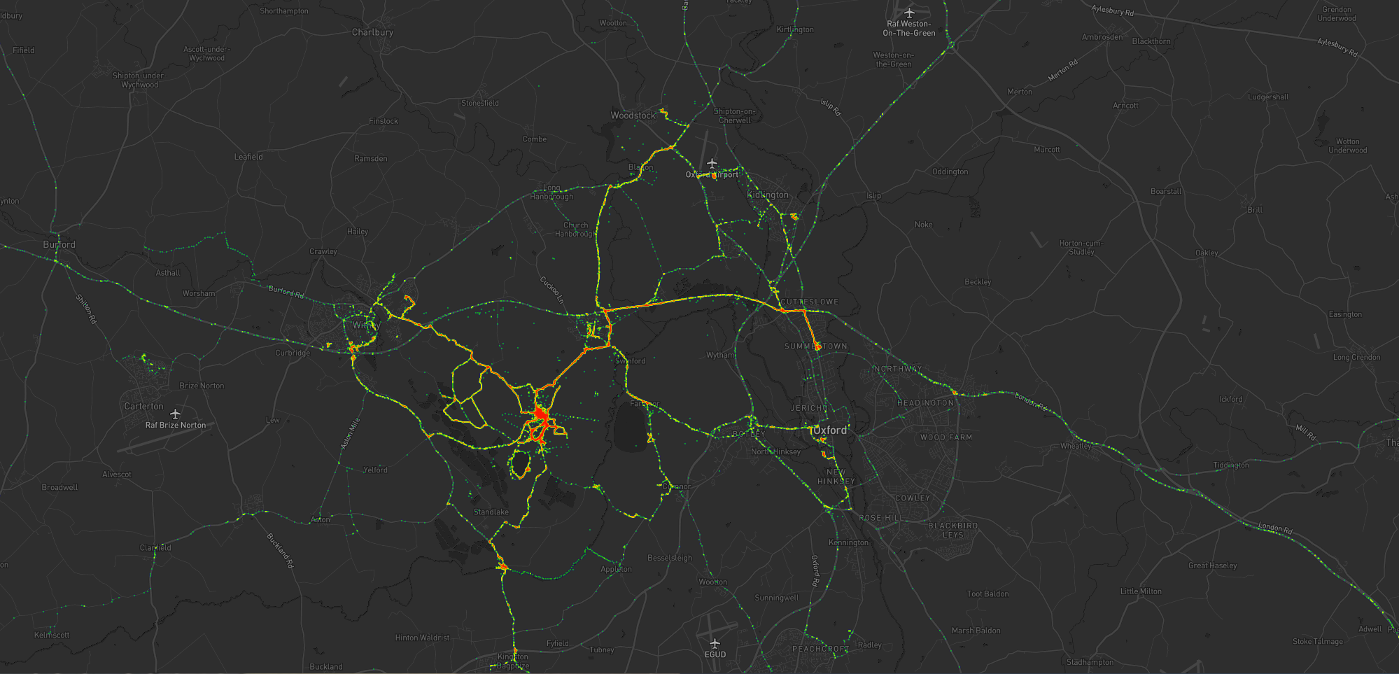
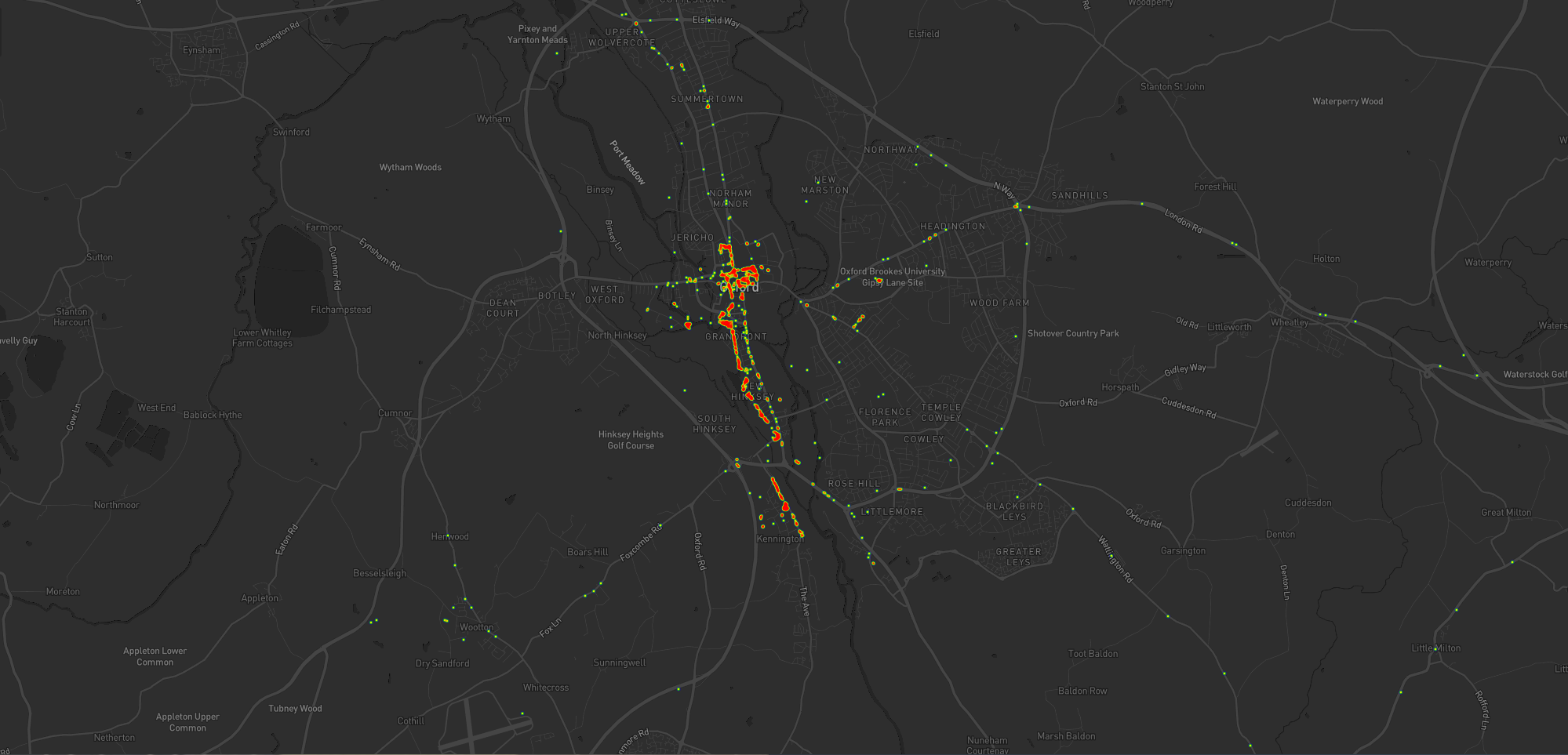
Let’s go back to the 7 years prior, when I lived in Kidlington. This paints a different picture:
For the seven years I lived in Kidlington I moved around a lot more than I have since: each hotspot tells a story, and some tell a few.
This heatmap highlights some of the ways in which my life was quite different. For example:
Most of my time was spent in my village, but it was a lot larger than the hamlet I live in now and this shows in the size of my local “blob”. It’s also possible to pick out common
destinations like the kids’ nursery and (later) school, the parks, and the routes to e.g. ballet classes, music classes, and other kid-focussed hotspots.
I worked at the Bodleian from early 2011 until late in 2019, and so I spent a lot of time in
Oxford City Centre and cycling up and down the roads connecting my home to my workplace: Banbury Road glows the brightest, but I spent some time on Woodstock Road too.
For some of this period I still volunteered with Samaritans in Oxford, and their branch – among other volunteering hotspots
– show up among my movements. Even without zooming in it’s also possible to make out individual venues I visited: pubs, a cinema, woodland and riverside walks, swimming pools etc.
Less-happily, it’s also obvious from the map that I spent a significant amount of time at the John Radcliffe Hospital, an unpleasant reminder of some challenging times from that
chapter of our lives.
The data’s visibly “spottier” here, mostly because I built the heatmap only out of the spatial data over the time period, and not over the full tracklogs (i.e. the map it doesn’t
concern itself with the movement between two sampled points, even where that movement is very-guessable), and some of the data comes from less-frequently-sampled sources like Google.
Eight to ten years ago
Let’s go back further:
Back when I lived in Kennington I moved around a lot less than I would come to later on (although again, the spottiness of the data makes that look more-significant than it is).
Before 2011, and before we bought our first house, I spent a couple of years living in Kennington, to the South of Oxford. Looking at
this heatmap, you’ll see:
I travelled a lot less. At the time, I didn’t have easy access to a car and – not having started my counselling qualification yet – I
didn’t even rent one to drive around very often. You can see my commute up the cyclepath through Hinksey into the City Centre, and you can even make out the outline of Oxford’s Covered
Market (where I’d often take my lunch) and a building in Osney Mead where I’d often deliver training courses.
Sometimes I’d commute along Abingdon Road, for a change; it’s a thinner line.
My volunteering at Samaritans stands out more-clearly, as do specific venues inside Oxford: bars, theatres, and cinemas – it’s the kind of heatmap that screams “this person doesn’t
have kids; they can do whatever they like!”
Every map tells a story
I really love maps, and I love the fact that these heatmaps are capable of painting a picture of me and what my life was like in each of these three distinct chapters of my life over
the last decade. I also really love that I’m able to collect and use all of the personal data that makes this possible, because it’s also proven useful in answering questions like “How
many times did I visit Preston in 2012?”, “Where was this photo taken?”, or “What was the name of that place we had lunch when we got lost during our holiday in Devon?”.
There’s so much value in personal geodata (that’s why unscrupulous companies will try so hard to steal it from you!), but sometimes all you want to do is use it to draw pretty heatmaps.
And that’s cool, too.
How these maps were generated
I have a μlogger instance with the relevant positional data in. I’ve automated my process, but the essence of it if you’d like to try it yourself is as follows:
First, write some SQL to extract all of the position data you need. I round off the latitude and longitude to 5 decimal places to help “cluster” dots for frequency-summing, and I raise
the frequency to the power of 3 to help make a clear gradient in my heatmap by making hotspots exponentially-brighter the more popular they are:
This data needs converting to JSON. I was using Ruby’s mysql2 gem to
fetch the data, so I only needed a .to_json call to do the conversion – like this:
db =Mysql2::Client.new(host: ENV['DB_HOST'], username: ENV['DB_USERNAME'], password: ENV['DB_PASSWORD'], database: ENV['DB_DATABASE'])
db.query(sql).to_a.to_json
Approximately following this guide and leveraging my Mapbox
subscription for the base map, I then just needed to include leaflet.js, heatmap.js, and leaflet-heatmap.js before writing some JavaScript code
like this:
body.innerHTML ='<div id="map"></div>';
let map = L.map('map').setView([51.76, -1.40], 10);
// add the base layer to the map
L.tileLayer('https://api.mapbox.com/styles/v1/{id}/tiles/{z}/{x}/{y}?access_token={accessToken}', {
maxZoom:18,
id:'itsdanq/ckslkmiid8q7j17ocziio7t46', // this is the style I defined for my map, using Mapbox
tileSize:512,
zoomOffset:-1,
accessToken:'...'// put your access token here if you need one!
}).addTo(map);
// fetch the heatmap JSON and render the heatmap
fetch('heat.json').then(r=>r.json()).then(json=>{
let heatmapLayer =new HeatmapOverlay({
"radius":parseFloat(document.querySelector('#radius').value),
"scaleRadius":true,
"useLocalExtrema":true,
});
heatmapLayer.setData({ data: json });
heatmapLayer.addTo(map);
});
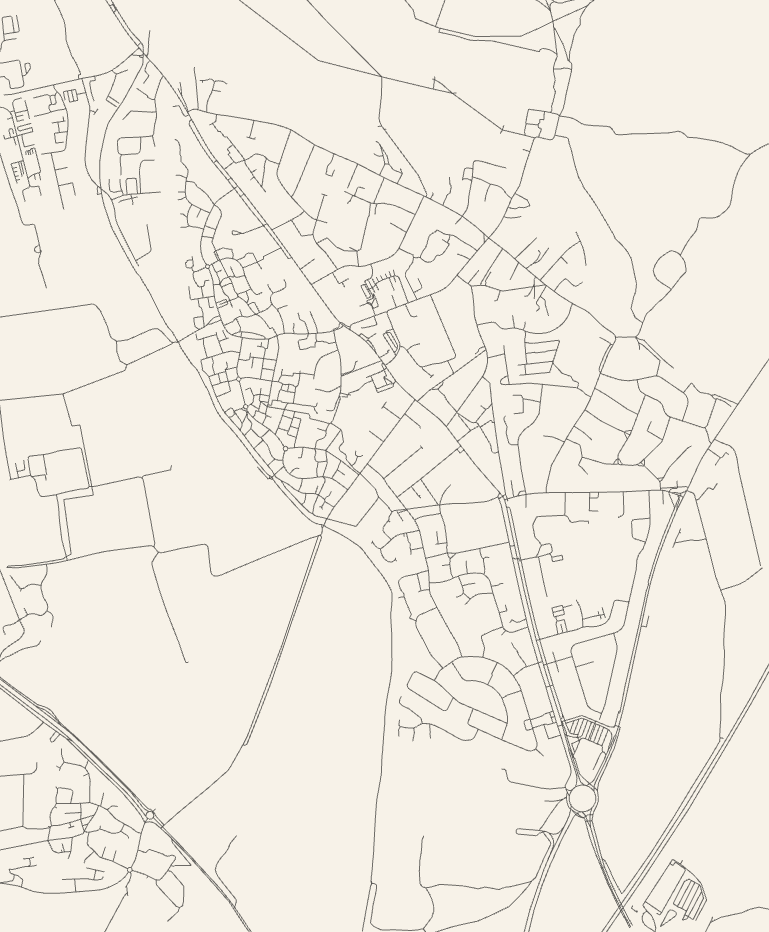
Cute open source project that produces on-demand SVG and PNG maps,
like the one above, based on the roads in OpenStreetMap data. It takes a somewhat liberal view of what a “road” is: I found it momentarily
challenging to get my bearings in the map above, which includes where I live, because the towpath and cycle paths are included which I hadn’t expected. Still a beautiful bit of output
and the source code could be adapted for any number of interesting cartographic projects.
A former colleague talks about some of the artefacts from the Bodleian’s collections that didn’t make it into the Talking Maps exhibition (one of the last exhibitions I got to work on during my time there; indeed, you’ll see plenty of
pictures from it in my post about making digital interactives). I was particularly pleased by the Soviet map of Oxford, but everything Nick presents
in this video is pretty awesome: it’s a great reminder that for every fantastic exhibition you see at a good museum, there’s always at least as much material “behind the
scenes” that you’re missing out on!
Hurrah! Another video from the Map Men, this time about the Cassini map of France and its legacy on contemporary cartography, presented in their usual hilarious style.
For those that don’t know, the skinny version is this: in May 2008 an XKCD comic was published proposing (or at least joking about) a new game with a
name reminiscient of geocaching. To play the game, participants use a mathematical hashing function on the current date
and the most recent Dow Jones Industrial Average opening value to generate sets of random coordinates around the
globe and then try to find their way to them, hopefully experiencing adventures along the way. The nature of stock markets and hashing functions means that the coordinates for any given
day are effectively random and impossible to predict (far) in advance, so it’s sometimes described as a spontaneous adventure generator.
The XKCD comic that started it all.
Recently, I found myself wondering about how much of a disadvantage players are at if they live in very “wet” graticules. Residents of the Channel Islands graticule (49 -2), for example, are confined to two land masses surrounded entirely by water. And while it’s
true that water hashpoints can be visited if you’re determined enough, it’s still got to be considered to be
playing at a disadvantage compared to those of us lucky ones in landlocked graticules like mine (51 -1).
And because I’m me and so can’t comfortably leave a question unanswered, I wrote a program to try to answer it! It’s among the hackiest, dirtiest software solutions I’ve ever written,
so if it works for you then it’s a flipping miracle. What it does is:
Determines which OpenStreetMap tiles (the image files served to your browser when you use OpenStreetMap) cover the graticule in question, and downloads them.
Extracts information about the colour of each pixel in each tile.
Counts the proportion of “water blue” pixels to other pixels (this isn’t perfect, because it trips over things like ferry lines on the map as being “not water”, especially at low
zoom-levels).
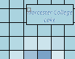
Some parts of Worcester College Lake are identified as “not water” on account of the text overlay.
I mentioned it was hacky, right?
You can try it for yourself, if you’d like. You’ll need NodeJS, wget, wc, and ImageMagick – all pretty standard or easy-to-get things on a typical Linux box. Run with
node geohash-pcwater.js 51 -1, where 51 -1 is the identifier for the graticule you’re interested in. And in case you’re interested – the Swindon graticule (where I live) is
about 0.68% water, but the Channel Islands graticule is closer to 93.13% water. That’s no small disadvantage: sorry, Channel Islands geohashers!
Update 2018-08-22: discovered some prior art that takes a
somewhat-similar approach.
If California were a country its economy would be the fifth largest in the world (just ahead of the UK). Yet the tech boom is
not the starkest way California has ever stood apart from its neighbours. That would surely be the maps depicting it as an island, entire of itself. Below we have featured our pick of
these glorious seventeenth- and eighteenth-century aberrations, from a collection of hundreds held at Stanford.
The intriguing story of how the maps came to be deserves a little mapping itself. In the 1530s Spanish explorers led by Hernán Cortés encountered the strip of land we now know as the
Baja Peninsula. They mistook it for an island and called it California.
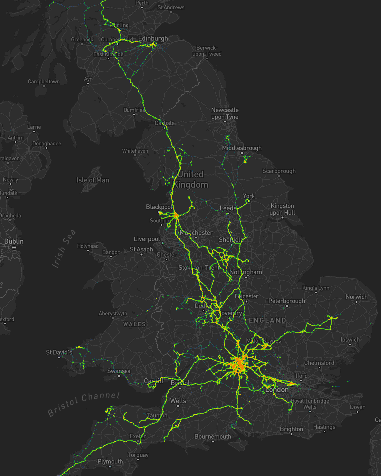
Recently, I learned that the roads in Great Britain are numbered in accordance with a scheme first imagined about ninety years ago, and, as it evolved, these road numbers were grouped into radial zones around London (except for Scotland, whose road
numbering only joined the scheme later). I’d often noticed the “clusters” of similarly-numbered roads (living in Aberystwyth, you soon notice that all the A and B roads start with a 4,
and I soon noticed that the very same A44 that starts in Aberystwyth seems to have followed me to my home here
in Oxford).
Road Numbering Zones of the United Kingdom
Who’d have thought that there was such a plan to it. If you’re aware of any of the many roads which are in the “wrong” zone, you’d be forgiven for not seeing the pattern earlier, though. However, seeing all of this
attempt at adding order to what was a chaotic system for the long period between the Romans leaving and the mid-20th century makes me wonder one thing: are there
“roadspotters”?
There exist trainspotters, who pursue the more-than-a-little-bit-nerdy hobby of traveling around and looking at different locomotives, marking down their numbers in notepads and
crossing them off in reference books. Does the same phenomena exist within road networks?
It turns out that it does; or some close approximation of it does, anyway. One gentleman, for example, writes about “recovering” road signs formerly of the A6144(M), which – until 2006 – was the UK’s only single-carriageway motorway. A site
calling itself The Motorway Archive has a thoroughly-researched article on the construction history of the M74/A74(M) from Glasgow to Carlisle. Another website – and one that I’m embarrassed to admit that I’d
visited on a number of previous occasions – reviews every motorway service area in
Britain. And, perhaps geekiest of all, the Society for All British and Irish Road
Enthusiasts (SABRE) maintains a club, meetups, and a thoroughly-researched wiki of everything you never wanted to know about the roads of the British Isles.
From what started as a quick question about British road numbering, I find myself learning about a hobby that’s perhaps even geekier than trainspotting. Thanks, Internet.

