One of my favourite parts of my former role at
the Bodleian Libraries was getting to work on exhibitions. Not just because it was varied and interesting work, but because it let me get
up-close to remarkable artifacts that
most people never even get the chance to see.
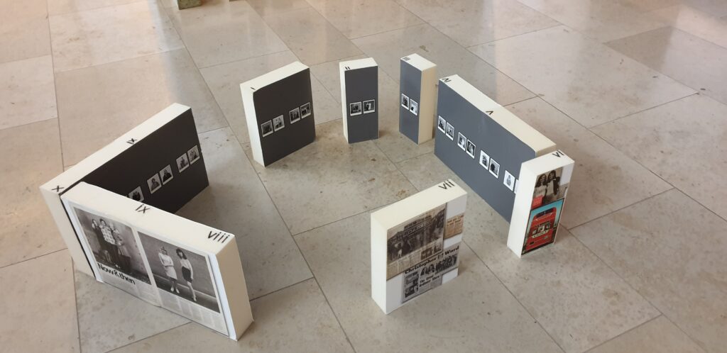
We also got to play dollhouse, laying out exhibitions in miniature.
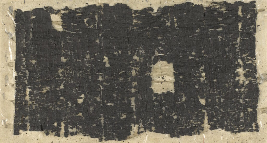
A personal favourite of mine are the Herculaneum Papyri. These charred scrolls were part of a private library near Pompeii that was buried by the eruption
of Mount Vesuvius in 79 CE. Rediscovered from 1752, these ~1,800 scrolls were distributed to academic institutions around the world, with
the majority residing in Naples’ Biblioteca Nazionale Vittorio Emanuele III.
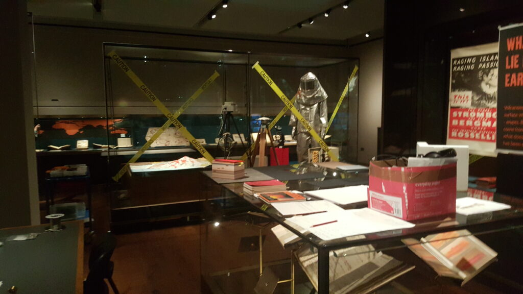
The second time I was in an exhibition room with the Bodleian’s rolled-up Herculaneum Papyri was for an exhibition specifically about humanity’s relationship with volcanoes.
As you might expect of ancient scrolls that got buried, baked, and then left to rot, they’re pretty fragile. That didn’t stop Victorian era researchers trying a variety of techniques to
gently unroll them and read what was inside.
Unrolling the scrolls tends to go about as well as you’d anticipate. A few have been deciphered this way. Many others have been damaged or destroyed by unrolling efforts.
Like many others, what I love about the Herculaneum Papyri is the air of mystery. Each could be anything from a lost religious text to, I don’t know, somebody’s to-do list (“buy milk, arrange for annual service of chariot, don’t forget to renew
volcano insurance…”).1
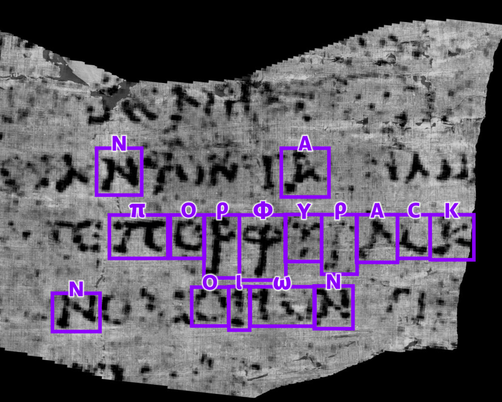
In recent years, we’ve tried “virtually unrolling” the scrolls using a variety of related technologies. And – slowly – we’re getting there.
X-ray tomography is amazing, but it’s hampered by the fact that the ink and paper have near-equivalent transparency to x-rays. Plus, all the other problems. But new techniques are helping to overcome them.
So imagine my delight when this week, for the first time ever, a
complete word was extracted from one of the carbonised, still-rolled-up scrolls from Herculaneum. Something that would have seemed inconceivable to the historians who first
discovered and catalogued the scrolls is now possible, thanks to their careful conservation over the years along with the steady advance of technology.
The word appears to be “purple”: either πορφύ̣ρ̣ας̣ (a noun, similar to how we might say “pass the purple [pen]” or πορφυ̣ρ̣ᾶς̣: if we can decode more words around it then it which
might become clear from the context.
Anyway, I thought that was exciting news so I wanted to share.
A former colleague talks about some of the artefacts from the Bodleian’s collections that didn’t make it into the Talking Maps exhibition (one of the last exhibitions I got to work on during my time there; indeed, you’ll see plenty of
pictures from it in my post about making digital interactives). I was particularly pleased by the Soviet map of Oxford, but everything Nick presents
in this video is pretty awesome: it’s a great reminder that for every fantastic exhibition you see at a good museum, there’s always at least as much material “behind the
scenes” that you’re missing out on!
As part of the preparing to leave the Bodleian I’ve been revisiting a lot of the documentation I’ve written over the last eight
years. It occurred to me that I’ve never written publicly about how the Bodleian’s digital signage/interactives actually work; there are possible lessons to learn.
The Bodleian‘s digital signage is perhaps more-diverse, both in terms of technology and audience, than that of most organisations. We’ve got
signs in areas that are exclusively reader-facing to help students and academics find what they’re looking for, signs in publicly accessible rooms that advertise and educate, and signs
in gallery spaces upon which we try to present engaging and often-interactive content to support exhibitions.
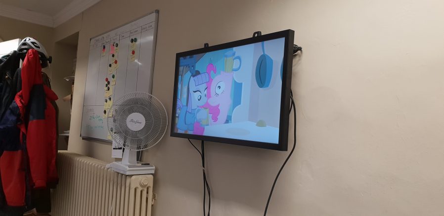
Getting an extra touchscreen for the office for prototyping/user testing purposes was great, even when it wasn’t showing MLP: FiM.
Throughout those three spheres, we’ve routinely delivered a diversity of content (let’s just ignore the countdown clock, for now…). Traditional
directional signage, advertisements, games, digital exhibitions, interpretation, feedback surveys…
In the vast majority of cases – and this is where the Bodleian’s been unusual (though certainly not unique) among cultural sector institutions – we’ve created
those in-house rather than outsourcing them.
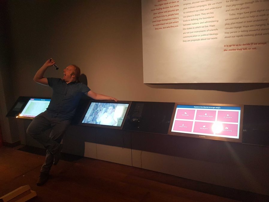
Using off-the-shelf technology also allows the Bodleian to in-house much of their hardware maintenance, as a secondary part of other job roles. Singing into your screwdriver remains
optional, though.
To do this economically – the volume of work on interactive signage is inconsistent throughout the year – we needed to align the skills required with skills used elsewhere in the
organisation. To do this, we use the web as our medium! Collectively, the Bodleian’s Digital Communications team already had at least some experience in programming, web design, graphic
design, research, user testing, copyediting etc.: the essential toolkit for web application development.
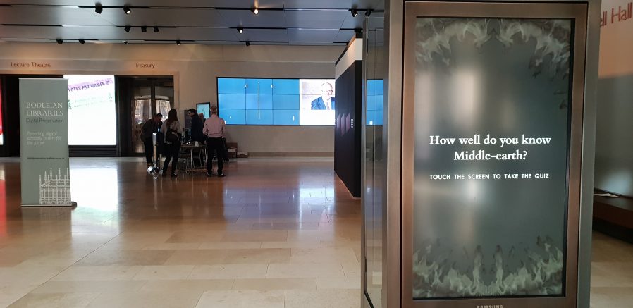
Whether you were playing Pong on the video wall at the back or testing your Middle-earth knowledge on the touchscreen at the front… behind the
scenes you were interacting with a web page I wrote.
By shifting our digital signage platform to lean heavily on web technologies, we were able to leverage talented people we already had to produce things that we might otherwise
have had to outsource. This, in turn, meant that more exhibitions and displays get digital enhancement, on a shorter turnaround.
It also means that there’s a tighter integration between exhibition content and content for web and social media: it’s easier for us to re-use content across multiple platforms.
Sometimes we’ve even made our digital interactives, or adapted version of them, available directly online, allowing our exhibitions to reach people that can’t get to our physical spaces
at all.
Because we’re able to produce our own content on-demand, even our smaller, shorter-duration displays can have hands-on digital interactives associated with them.
On to the technology! We’re using a real mixture of tech: when it’s donated or reclaimed from previous projects (and when the bidding and acquisition processes are, well… as you’d
expect at the University of Oxford), you learn not to say no to freebies. Our fleet includes:
Samsung Android tablets with freestanding kiosk frames. We run the excellent-value Kiosk Browser Lockdown app on
these, which loads on boot and prevents access to anything but a specified website.
OnelanNTBs connected to a mixture of
touch and non-touch screens, wall-mounted or in kiosk frames. We use Onelan’s standard digital signage features as well as – for interactive content – their built-in touch-capable web
browser.
Dell PCs of the standard variety supplied by University IT services, connected to wall-mounted touch screens, running Google Chrome in Kiosk Mode. More on this below.
The browsers’ responsive simulators are invaluable when we’re targeting signage at five (!) different resolutions.
When you’re developing content for a very small number of browsers and a limited set of screen sizes, you quickly learn to throw a lot of “best practice” web development out of the
window. You’ll never come across a text browser or screen reader, so alt-text doesn’t matter. You’ll never have to rescale responsively, so you might as well absolutely-position almost
everything. The devices are all your own, so you never need to ask permission to store cookies. And because you control the platform, you can get away with making configuration tweaks
to e.g. allow autoplaying videos with audio. Coming from a conventional web developer background to producing digital signage content makes feels incredibly lazy.
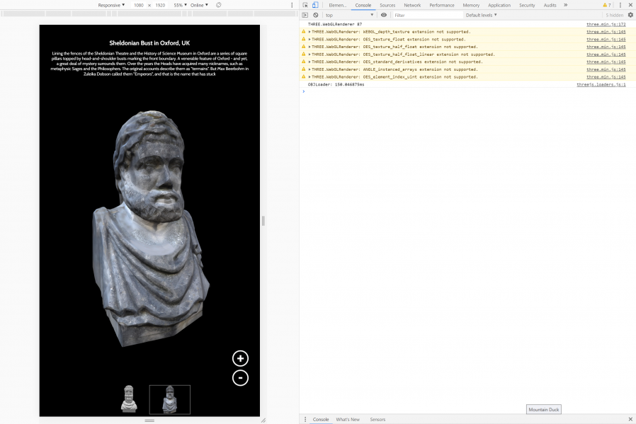
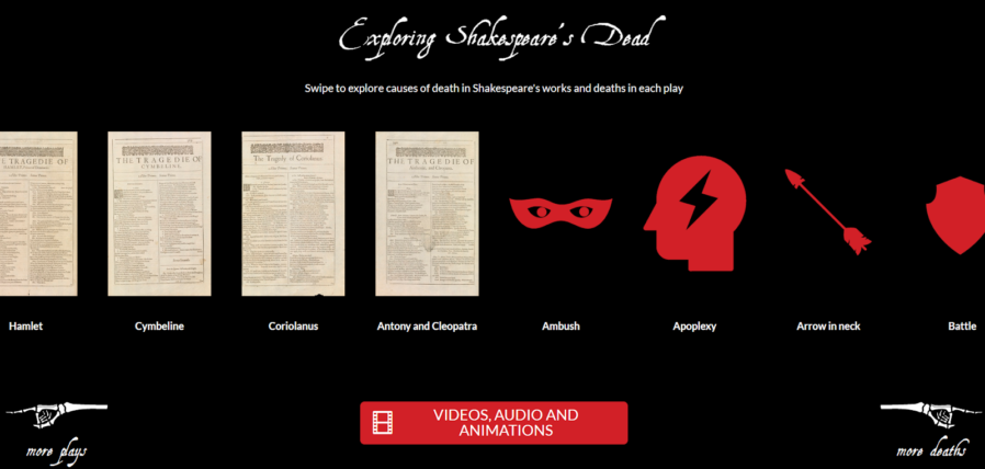
Helping your users see your interactive as “app-like” rather than “web-like” encourages them to feel comfortable engaging with it in ways uncharacteristic of web pages. In our Shakespeare’s Dead interactive, for example, we started the experience in the middle of a long horizontally-scrolling “page”, which might
feel very unusual in a conventional browser.
Using Chrome to run digital signage requires, in the Bodleian’s case, a couple of configuration tweaks and the right command-line switches. We use:
chrome://flags/#overscroll-history-navigation – disabling this prevents users from triggering “back”/”forward” by swiping with two fingers
chrome://flags/#pull-to-refresh – disabling this prevents the user from triggering a “refresh” by scrolling up beyond the top of the page (this only happens on some
kinds of devices)
chrome://flags/#system-keyboard-lock – we don’t use attached keyboards, but if you do, you might want to set this flag so you can use the keyboard.lock()
API to intercept e.g. ALT+F4 so users can’t escape the application
running on startup with e.g. chrome --kiosk --noerrdialogs --allow-file-access-from-files --disable-touch-drag-drop --incognito https://example.com/some/url
Kisok mode makes the browser run fullscreen and prevents e.g. opening additional tabs, giving an instant “app-like” experience. As we don’t have keyboards attached to our
digital signage, this also prevents visitors from closing Chrome.
Turning off error dialogs reduces the risk that an error will result in an unslightly message to the user.
Enabling “file access from files” allows content hosted at file:// addresses to access content at other file:// addresses, which makes it possible to write “offline” sites
(sometimes useful where we’re serving large videos or on previous occasions when WiFi has been shaky) that can still take advantage of features like the Fetch API.
Unless you need drag-and-drop, it’s simpler to disable it; this prevents a user long-press-and-dragging an image around the screen.
Incognito mode ensures that the browser doesn’t remember what site was showing last time it ran; our computers often end up switched off at the wall at the end of the day, and
without this the browser will offer to load the site it had open last time, when it runs.
We usually host our interactives directly on the web, at “secret” addresses, and this is generally preferable to us as we can more-easily make on-the-fly adjustments to
content (plus it makes it easier to hook up analytic tools).
Be sure to test the capabilities of your hardware! Our Onelan NTBs, unlike your desktop PCs, can’t handle multitouch input, which
affects the design of our user interfaces for these devices.
Meanwhile, in the application’s CSS code, we set * { user-select: none; } to prevent the user from highlighting
text by selecting it with their finger. We also make heavy use of absolutely-sized/positioned, overflow: hidden blocks to ensure that scrollbars never appear, and
CSS animations to make content feel dynamic and to draw attention to particular elements.
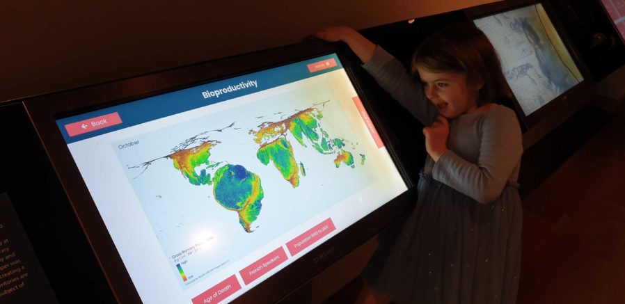
There’s no substitute for good testing. And there’s no stress-testing quite like letting a 5 year-old loose on your work.
Altogether, this approach gives the Bodleian the capability to produce engaging interactive content at low cost and using the existing skills of their digital and exhibitions teams.
It’s not an approach that would work for every cultural institution: in particular, some of the Bodleian’s sister institutions already
outsource the technical parts of their web work, and so don’t have the expertise in-house to share with a web-powered digital signage solution.
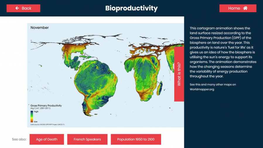
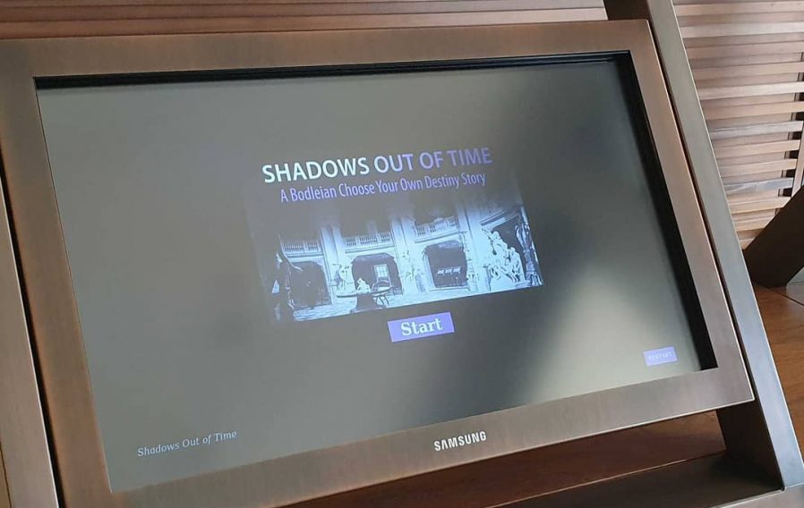
A few minor CSS tweaks to make the buttons finger-friendly and our Halloween game Shadows Out Of
Time, which I’d already made web-friendly, was touchscreen-ready too. I wonder if they’ll get this one out again, this
Halloween?
But for those museums that can fit into this model – or can adapt to do so in future – using the web to produce interactive digital content and digital signage is a highly
cost-effective way to engage with visitors, even (or especially!) when dealing with short-lived and/or rotating displays.
It’s also been among my favourite parts of my job at the Bod these last 8½ years, and I’m sure I’ll miss it!
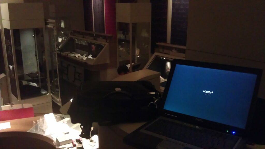
From an elevated position in the exhibition room, I run a few tests of the technical infrastructure whilst other staff set up, below.
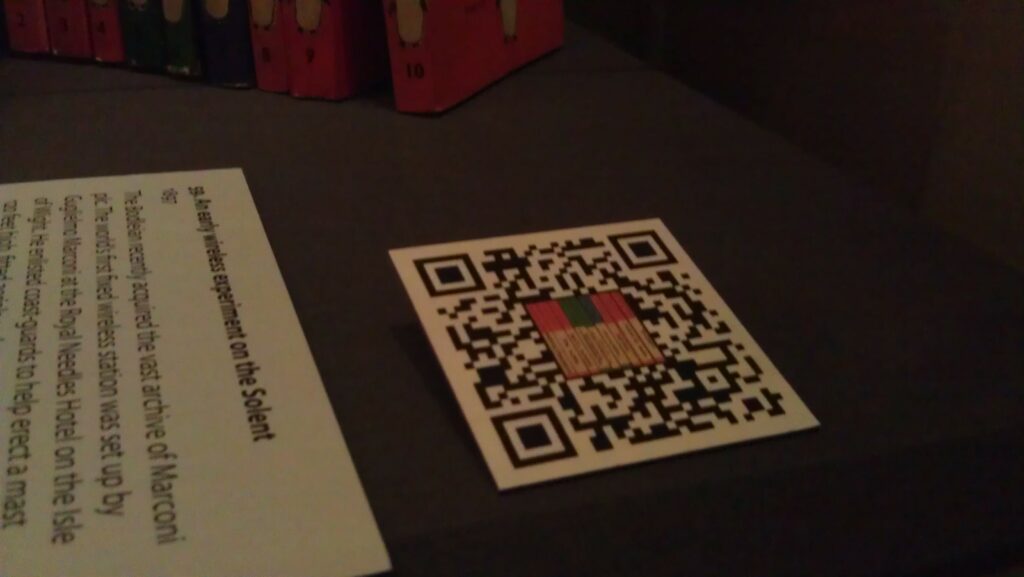
In particular, something I’ve been working on are the QR codes. This
experiment – very progressive for a sometimes old-fashioned establishment like the Bodleian – involves small two-dimensional barcodes being placed with the exhibits. The barcodes are
embedded with web addresses for each exhibit’s page on the exhibition website. Visitors who scan them – using a tablet computer, smartphone, or whatever – are directed to a web page
where they can learn more about the item in front of them and can there discuss it with other visitors or can “vote” on it: another exciting new feature in this exhibition is that we’re
trying quite hard to engage academics and the public in debate about the nature of “treasures”: what is a treasure?
A QR code in place at the Treasures of the Bodleian exhibition.
In order to improve the perceived “connection” between the QR code and the objects, to try to encourage visitors to scan the codes despite perhaps having little or no instruction, we
opted to embed images in the QR codes relating to the objects they related to. By cranking up the error-correction level of a QR code, it’s possible to “damage” them quite significantly and still have them scan perfectly well.
One of my “damaged” QR codes. This one corresponds to The Laxton Map, a 17th Century map of common farming land near Newark on Trent.
We hope that the visual association between each artefact and its QR code will help to make it clear that the code is related to the item (and isn’t, for example, some kind of asset tag
for the display case or something). We’re going to be monitoring usage of the codes, so hopefully we’ll get some meaningful results that could be valuable for future exhibitions: or for
other libraries and museums.
Rolling Your Own
If you’re interested in making your own QR codes with artistic embellishment (and I’m sure a graphic designer could do a far better job than I did!), here’s my approach:
I used Google Infographics (part of Chart Tools) to produce my QR codes. It’s fast, free,
simple, and – crucially – allows control over the level of error correction used in the resulting code. Here’s a sample URL to generate the QR code above:
500×500 is the size of the QR code. I was ultimately producing 5cm codes because our experiments showed that this was about the right size
for our exhibition cabinets, the distance from which people would be scanning them, etc. For laziness, then, I produced codes 500 pixels square at a resolution of 100 pixels per
centimetre.
H specifies that we want to have an error-correction level of 30%, the maximum possible. In theory, at least, this allows us to do the maximum
amount of “damage” to our QR code, by manipulating it, and still have it work; you could try lower levels if you wanted, and possibly get less-complex-looking codes.
0 is the width of the border around the QR code. I didn’t want a border (as I was going to manipulate the code in Photoshop anyway), so I use
a width of 0.
The URL – HTTP://TREASURES.BODLEIAN.OX.AC.UK/T7 – is presented entirely in capitals. This is because capital letters use fewer bits
when encoded as QR codes. “http” and domain names are case-insensitive anyway, and we selected our QR code path names to be in capitals. We also shortened the URL as far as possible:
owing to some complicated technical and political limitations, we weren’t able to lean on URL-shortening services like bit.ly, so we had to roll our own. In
hindsight, it’d have been nice to have set up the subdomain “t.bodleian.ox.ac.uk”, but this wasn’t possible within the time available. Remember: the shorter the web address, the simpler
the code, and simpler codes are easier and faster to read.
Our short URLs redirect to the actual web pages of each exhibit, along with an identifying token that gets picked up by Google Analytics to track how widely the QR codes are being used (and which ones are most-popular amongst visitors).
By now, you’ll have a QR code that looks a little like this.
Load that code up in Photoshop, along with the image you’d like to superimpose into it. Many of the images I’ve had to work with are disturbingly “square”, so I’ve simply taken
them, given them a white or black border (depending on whether they’re dark or light-coloured). With others, though, I’ve been able to cut around some of the more-attractive parts of
the image in order to produce something with a nicer shape to it. In any case, put your image in as a layer on top of your QR code.
Move the image around until you have something that’s aesthetically-appealing. With most of my square images, I’ve just plonked them in the middle and resized them to cover a whole
number of “squares” of the QR code. With the unusually-shaped ones, I’ve positioned them such that they fit in with the pattern of the QR code, somewhat, then I’ve inserted another
layer in-between the two and used it to “white out” the QR codes squares that intersect with my image, giving a jagged, “cut out” feel.
Test! Scan the QR code from your screen, and again later from paper, to make sure that it’s intact and functional. If it’s not, adjust your overlay so that it covers less of the QR
code. Test in a variety of devices. In theory, it should be possible to calculate how much damage you can cause to a QR code before it stops working (and where it’s safe to cause the
damage), but in practice it’s faster to use trial-and-error. After a while, you get a knack for it, and you almost feel as though you can see where you need to put the images so that
they just-barely don’t break the codes. Good luck!
Another of my “damaged” QR codes. I’m reasonably pleased with this one.
Give it a go! Make some QR codes that represent your content (web addresses, text, vCards, or whatever) and embed your own images into them to make them stand out with a style of their
own.