Water Science #2

Back in 2019, the kids – so much younger back then! – and I helped undertake some crowdsourced citizen science for the Thames WaterBlitz. This year, we’re helping out again.

Screenshot from FreshWater Watch's slightly-shonky dataviewer, showing that 3 participants took a sample from Oxford Canal bridge 228 on 21 September 2019.
It really is “open data”. Look: I found the record that was created as a result of the kids’ and my participation back in 2019!

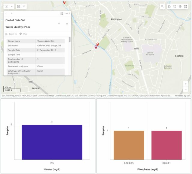
We’ve moved house since then, but we’re still within the Thames basin and can provide value by taking part in this weekend’s sampling activity. The data that gets collected on nitrate and phosphate levels in local water sources –  among other observations – gets fed into an open dataset for the benefit of scientists and laypeople.

Two young children assess the colour of some canal water, beneath a bridge.
The kids were smaller last time we did this.

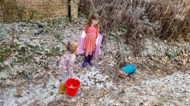
It’d have been tempting to be exceptionally lazy and measure the intermittent water course that runs through our garden! It’s an old, partially-culverted drainage ditch1, but it’s already reached the “dry” part of its year and taking a sample wouldn’t be possible right now.

Two children wearing wellies stand in a ditch, breaking ice into chunks.
The ditch in our garden is empty 75% and full of water 25% of the time. Oh, and full of ice for a few days each winter, to the delight of children who love smashing things. (It’s also full of fallen wood and leaf detritus most of the year and JTA spends a surprising amount of time dredging it so that it drains properly into its next section.)

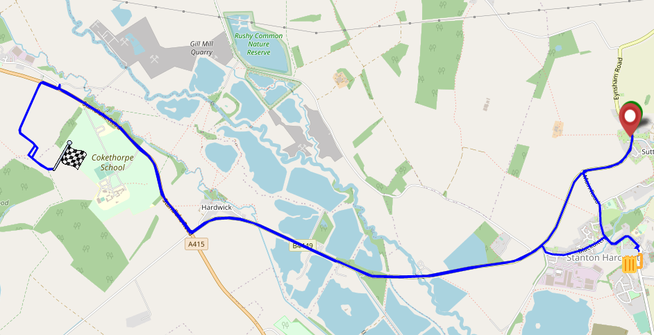
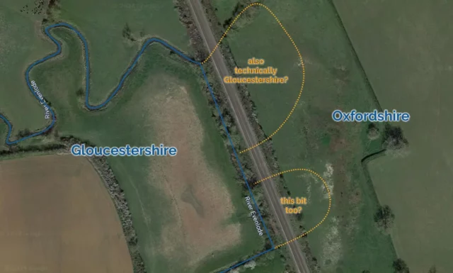
But more-importantly: the focus of this season’s study is the River Evenlode, and we’re not in its drainage basin! So we packed up a picnic and took an outing to the North Leigh Roman Villa, which I first visited last year when I was supposed to be on the Isle of Man with Ruth.

Dan kneels on a striped picnic mat with a 7-year-old and a 10-year old child alongside some sandwiches, iced fingers, Pepperami, fruit, and pretzels.
“Kids, we’re going outside…” / “Awww! Noooo!” / “…for a picnic and some science!” / “Yayyy!”

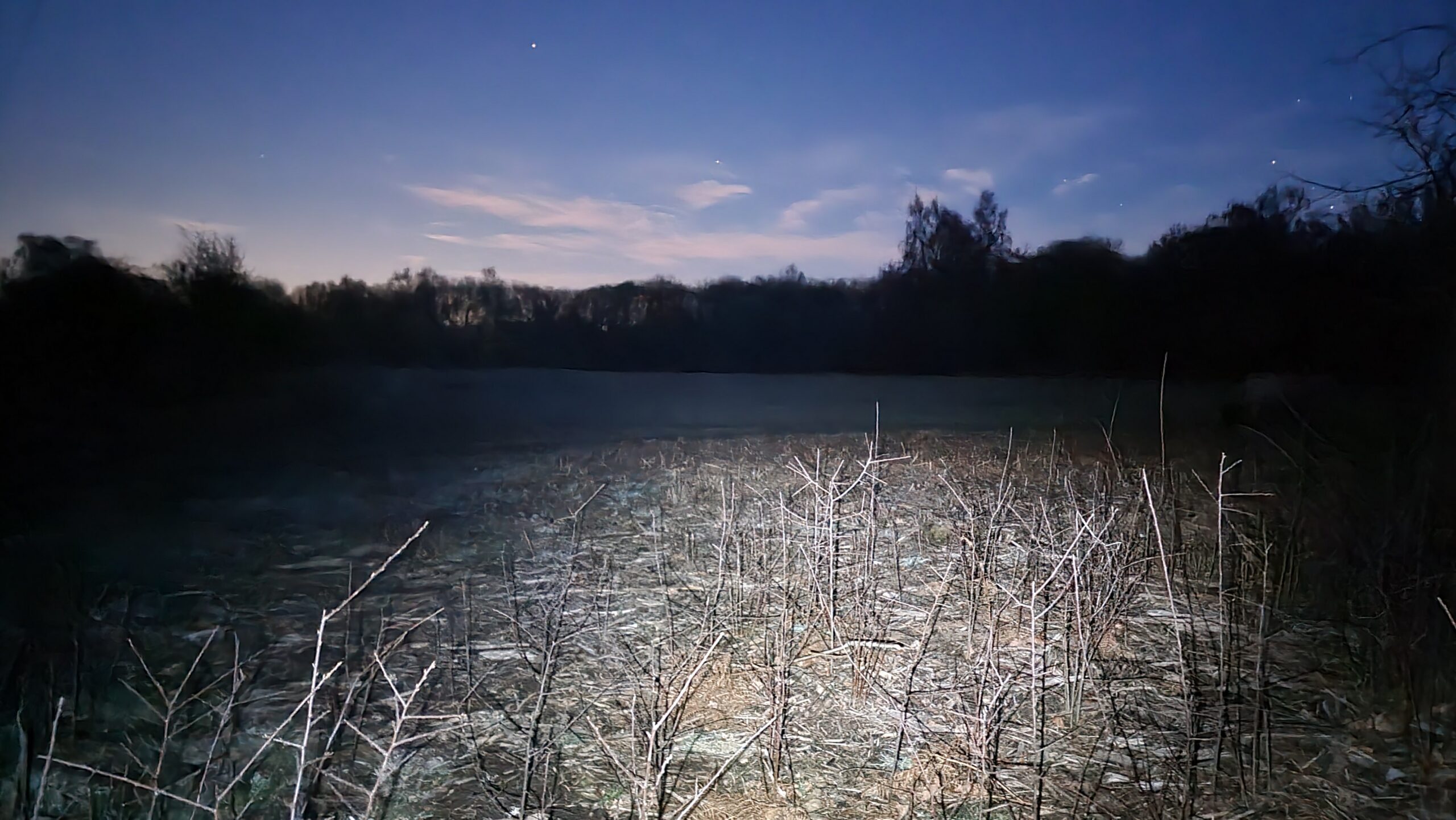
Our lunch consumed, we set off for the riverbank, and discovered that the field between us and the river was more than a little waterlogged. One of the two children had been savvy enough to put her wellies on when we suggested, but the other (who claims his wellies have holes in, or don’t fit, or some other moderately-implausible excuse for not wearing them) was in trainers and Ruth and I needed to do a careful balancing act, holding his hands, to get him across some of the tougher and boggier bits.

A 7-year-old boy in a grey camo coat balances on a blank over a large muddy puddle: he's about to attempt to cross a log to a gate into the next field (which also looks pretty wet). Ruth, who doesn't much like featuring in photos, has been digitally-removed from this one (she was standing at the far side ready to catch the balancing child!).
Trainers might not have been the optimal choice of footwear for this particular adventure.

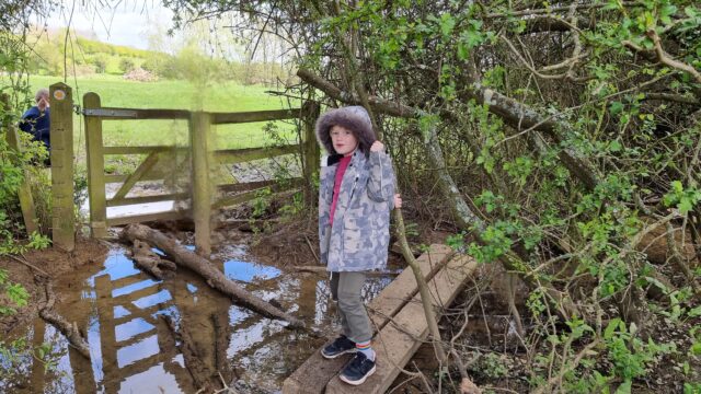
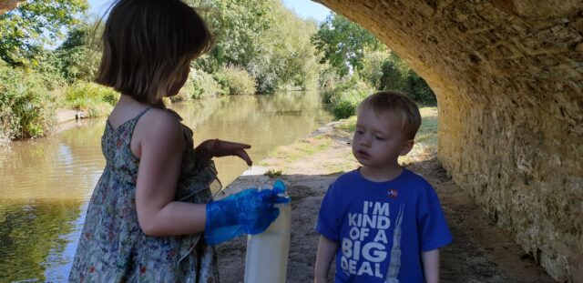
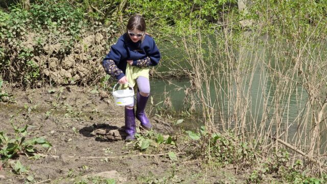
Eventually we reached the river, near where the Cotswold Line crosses it for the fifth time on its way out of Oxford. There, almost-underneath the viaduct, we sent the wellie-wearing eldest child into the river to draw us out a sample of water for testing.

Map showing the border between Gloucestershire and Oxfordshire as defined by the original path of the River Evenlode near Kingham, but the Evenlode has been redirected as part of the construction of the railway, putting two small bits of Gloucestershire on the "wrong side" of the river.
As far as Moreton-in-Marsh, the Cotswold Line out of Oxford essentially follows the River Evenlode. In some places, such as this one near Kingham, the river was redirected to facilitate the construction of the railway. Given that the historic Gloucestershire/Oxfordshire boundary was at this point defined by the river, it’s not clear whether this represents the annexation of two territories of Gloucestershire by Oxfordshire. I doubt that anybody cares except map nerds.

Looking into our bucket, we were pleased to discover that it was, relatively-speaking, teeming with life: small insects and a little fish-like thing wriggled around in our water sample2. This, along with the moorhen we disturbed3 as we tramped into the reeds, suggested that the river is at least in some level of good-health at this point in its course.

A 10-year old girl wearing sunglasses and purple wellies holds her skirt up out of the water as she wades up the muddy bank of a river carrying a tub of water.
I’m sure our eldest would have volunteered to be the one to traipse through the mud and into the river even if she hadn’t been the only one of that was wearing wellies.

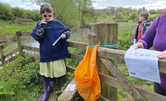
We were interested to observe that while the phosphate levels in the river were very high, the nitrate levels are much lower than they were recorded near this spot in a previous year. Previous years’ studies of the Evenlode have mostly taken place later in the year – around July – so we wondered if phosphate-containing agricultural runoff is a bigger problem later in the Spring. Hopefully our data will help researchers answer exactly that kind of question.

Children stand around at a riverside stile while a colour-changing chemical in a vial does its thing.
The chemical experiments take up to 5 minutes each to develop before you can read their colours, so the kids had plenty of time to write-up their visual observations while they waited.

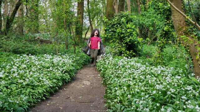
Regardless of the value of the data we collected, it was a delightful excuse for a walk, a picnic, and to learn a little about the health of a local river. On the way back to the car, I showed the kids how to identify wild garlic, which is fully in bloom in the woods nearby, and they spent the rest of the journey back chomping down on wild garlic leaves.

A 7-year-old wearing his coat inside-out and as a cape runs excitedly into a forest path overgrown with wild garlic.
Seriously, that’s a lot of wild garlic.

The car now smells of wild garlic. So I guess we get a smelly souvenir from this trip, too4!

Footnotes

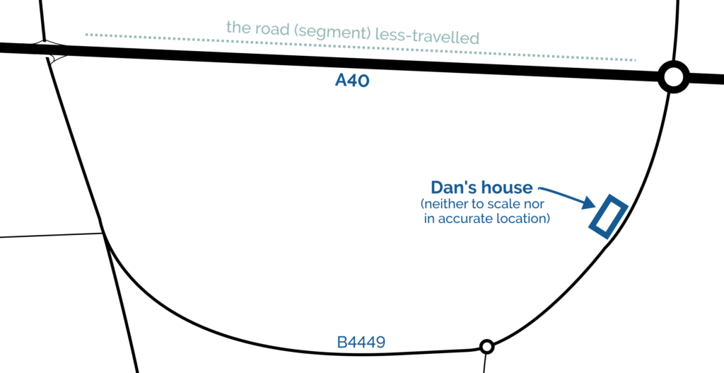
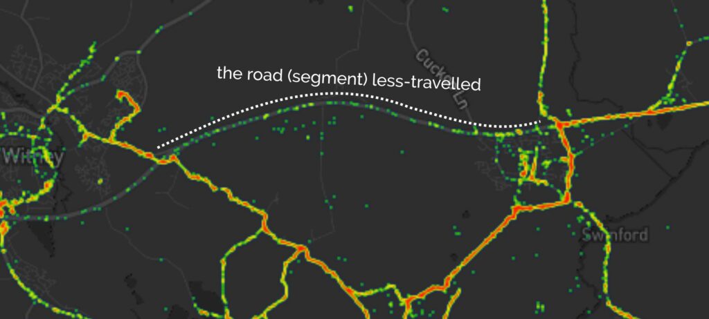
1 Our garden ditch, long with a network of similar channels around our village, feeds into Limb Brook. After a meandering journey around the farms to the East this eventually merges with Chill Brook to become Wharf Stream. Wharf Stream passes through a delightful nature reserve before feeding into the Thames near Swinford Toll Bridge.

2 Needless to say, we were careful not to include these little animals in our chemical experiments but let them wait in the bucket for a few minutes and then be returned to their homes.

3 We didn’t catch the moorhen in a bucket, though, just to be clear.

4 Not counting the smelly souvenir that was our muddy boots after splodging our way through a waterlogged field, twice

Screenshot from FreshWater Watch's slightly-shonky dataviewer, showing that 3 participants took a sample from Oxford Canal bridge 228 on 21 September 2019.× Two young children assess the colour of some canal water, beneath a bridge.× Two children wearing wellies stand in a ditch, breaking ice into chunks.× Dan kneels on a striped picnic mat with a 7-year-old and a 10-year old child alongside some sandwiches, iced fingers, Pepperami, fruit, and pretzels.× A 7-year-old boy in a grey camo coat balances on a blank over a large muddy puddle: he's about to attempt to cross a log to a gate into the next field (which also looks pretty wet). Ruth, who doesn't much like featuring in photos, has been digitally-removed from this one (she was standing at the far side ready to catch the balancing child!).× Map showing the border between Gloucestershire and Oxfordshire as defined by the original path of the River Evenlode near Kingham, but the Evenlode has been redirected as part of the construction of the railway, putting two small bits of Gloucestershire on the "wrong side" of the river.× A 10-year old girl wearing sunglasses and purple wellies holds her skirt up out of the water as she wades up the muddy bank of a river carrying a tub of water.× Children stand around at a riverside stile while a colour-changing chemical in a vial does its thing.× A 7-year-old wearing his coat inside-out and as a cape runs excitedly into a forest path overgrown with wild garlic.×

My Geo*ing Limits

I thought it might be fun to try to map the limits of my geocaching/geohashing. That is, to draw the smallest possible convex polygon that surrounds all of the geocaches I’ve found and geohashpoints I’ve successfully visited.

World map showing the outer extent of the areas in which Dan has geocached/geohashed. A shaded polygon covers the UK (except the far North of Scotland), parts of California, Cape Town, and parts of Italy and Austria.

Mathematically, such a shape is a convex hull – the smallest polygon encircling a set of points without concavity. Here’s how I made it:

1. Extract all the longitude/latitude pairs for every successful geocaching find and geohashpoint expedition. I keep them in my blog database, so I was able to use some SQL to fetch them:

SELECT DISTINCT coord_lon.meta_value lon, coord_lat.meta_value lat
FROM wp_posts
LEFT JOIN wp_postmeta expedition_result ON wp_posts.ID = expedition_result.post_id AND expedition_result.meta_key = 'checkin_type'
LEFT JOIN wp_postmeta coord_lat ON wp_posts.ID = coord_lat.post_id AND coord_lat.meta_key = 'checkin_latitude'
LEFT JOIN wp_postmeta coord_lon ON wp_posts.ID = coord_lon.post_id AND coord_lon.meta_key = 'checkin_longitude'
LEFT JOIN wp_term_relationships ON wp_posts.ID = wp_term_relationships.object_id
LEFT JOIN wp_term_taxonomy ON wp_term_relationships.term_taxonomy_id = wp_term_taxonomy.term_taxonomy_id
LEFT JOIN wp_terms ON wp_term_taxonomy.term_id = wp_terms.term_id
WHERE wp_posts.post_type = 'post' AND wp_posts.post_status = 'publish'
AND wp_term_taxonomy.taxonomy = 'kind'
AND wp_terms.slug = 'checkin'
AND expedition_result.meta_value IN ('Found it', 'found', 'coordinates reached', 'Attended');

2. Next, I determine the convex hull of these points. There are an interesting variety of algorithms for this so I adapted the Monotone Chain approach (there are convenient implementations in many languages). The algorithm seems pretty efficient, although that doesn’t matter much to me because I’m caching the results for a fortnight.

Animation showing an algorithm draw lines from point to point, selecting each point by avoiding counter-clockwise turns.
I watched way too many animations of different convex hull algorithms before selecting this one… pretty-much arbitrarily.

3. Finally, I push the hull coordinates into Geoapify, who provide mapping services to me. My full source code is available.

An up-to-date (well, no-more than two weeks outdated) version of the map appears on my geo* stats page. I don’t often get to go caching/hashing outside the bounds already-depicted, but I’m excited to try to find opportunities to push the boundaries outwards as I continue to explore the world!

(I could, I suppose, try to draw a second larger area of places I’ve visited: the difference between the smaller and larger areas would represent all of the opportunities I’d missed to find a hashpoint!)

Animation showing an algorithm draw lines from point to point, selecting each point by avoiding counter-clockwise turns.× World map showing the outer extent of the areas in which Dan has geocached/geohashed. A shaded polygon covers the UK (except the far North of Scotland), parts of California, Cape Town, and parts of Italy and Austria.×

The Road (Segment) Less Travelled

Map showing approximate location of Dan's house, on a set of rural roads that connect to the A40 in two different places, with the segment between the two relevant junctions marked.

There are two junctions at which I can join the A40 trunk road from my house. When I drive East, I use the Easternmost of the two; when I drive West, I use the Westernmost; but I almost never drive the stretch of road between them!

A few years ago I generated heatmaps of my movements based on my long-running personal location log and, indeed, it shows a “cool spot” along this section of road too:

Heatmap showing a "cool spot" on the road (segment) less-travelled.

It’s inevitable I suppose that there should exist a “road (segment) less-travelled” right on my doorstep, but it still feels strange. Like when you live near a tourist attraction that you never get around to visiting. Except instead of a tourist attraction, I live near a major highway I rarely use.

Maybe I’m missing out on something great. Probably the commuters who use that road to get into and out of Oxford don’t think so.

Map showing approximate location of Dan's house, on a set of rural roads that connect to the A40 in two different places, with the segment between the two relevant junctions marked.× Heatmap showing a "cool spot" on the road (segment) less-travelled.×

Geohashing expedition 2023-03-10 51 -1

This checkin to geohash 2023-03-10 51 -1 reflects a geohashing expedition. See more of Dan's hash logs.

Location

North Leigh Common, West Oxfordshire.

Participants

Plans

My evening just freed up, so – weather-permitting – I might brave the sleet and cold and cycle out to this hashpoint this evening.

Expedition

Our dog had surgery at the start of the week and has now recovered enough to want a short walk, so I changed my plan to cycle for one to drive (with the dog) out to somewhere near the hashpoint and take her for a walk to and around it. Amazingly, I might have been faster to cycle: a crash on the A40 had lead to lots of traffic being re-routed along the exact same back roads that was to be my most-direct route, and on the local rat run through South Leigh I got trapped behind a line of folks who weren’t familiar with this particular unlit and twisty road and took the entire derestricted section at an average of 25mph. Ah well.

Out of laziness, I didn’t bring my GPSr or make a tracklog; I just used the Geohashdroid app and took a screenshot when I got there. South Leigh Common is pleasant, but it was dark, and my photos are all a little bit hard to make out! But the stars were beautiful tonight, and the dog loved one of her first outings since her surgery and enjoying running around in the long wet grass and sticking her head into rabbit holes. At 19:00 precisely I got within about a metre and a half of the hashpoint – well within the circle of uncertainty – and turned to head home.

I also took the time while there to update OpenStreetMap by drawing in the boundaries of the common, replacing the nondescript “point” that had marked it before.

Photos

Geohashing expedition 2022-12-05 51 -1

This checkin to geohash 2022-12-05 51 -1 reflects a geohashing expedition. See more of Dan's hash logs.

Location

Bridleway behind Cokethorpe School, West Oxfordshire, UK.

Participants

Expedition

When I saw this hashpoint appear I thought to myself: that’s eminently achievable! I hoped I might be able to slip away from work for a lunchtime cycle to claim it.

But the gods of technology didn’t approve of my plan and turned my workday into a catastrophe of the kind that only a computer can, and the chance of taking a long lunch evaporated quickly. But fortune dealt me a second hand when the weather held off into the evening, and I instead opted for a post-dinner huckle in the dark out to this hashpoint.

I set out around 18:30, South through Stanton Harcourt then North up the adorably-named Ducklington Road. It took some time to sight the somewhat-concealed bridleway around the hill of Cokethorpe School. And then, another challenge – navigating by OpenStreetMap I missed my turning and went straight through a farmyard, and had to carry my bike over a fence at the other end. Turns out the map is wrong and I later found a sign indicating the true course of the bridleway; I’ll get that corrected.

I abandoned my bike for the final 50 metres, trekking through the thick grass of an unmown meadow to the hashpoint and arriving around 19:00. No panoramic photo today it’s too dark – but you get a silly grin.

Pleased with this fast expedition, I diverted on my route home to the Harcourt Arms pub for a pint of their surprisingly-delicious seasonal guest ale, Fairytale of Brew York, which genuinely tastes like stollen. There, I wrote up this expedition report, but I’ll have to get home before I can extract my GPSr‘s tracklog.

Tracklog

Map showing a journey from Sutton, near Stanton Harcourt, along the B4449 then up the A415 past Cokethorpe School, then along a bridleway and into a field (where a chequered flag icon appears), then back to the centre of Stanton Harcourt (where a beer icon appears) before returning to the start point in Sutton.

Download tracklog

Photos

Automattic International

(This is yet another post about Automattic. Seee more posts about my experience of working at Automattic.)

Off the back of my recent post about privileges I enjoy as a result of my location and first language, even at my highly-multinational employer, and inspired by my colleague Atanas‘ data-mining into where Automatticians are located, I decided to do another treemap, this time about which countries Automatticians call home:

Where are the Automatticians?

Treemap showing countries of Automatticians. North America and specifically the USA dominates, the UK has the most in Europe, etc.
If raw data’s your thing (or if you’re just struggling to make out the names of the countries with fewer Automatticians), here’s a CSV file for you.

To get a better picture of that, let’s plot a couple of cartograms. This animation cycles between showing countries at (a) their actual (landmass) size and (b) approximately proportional to the number of Automatticians based in each country:

Animation showing countries "actual size" changing to proportional-to-Automattician-presence.
This animation alternates between showing countries at “actual size” and proportional to the number of Automatticians based there. North America and Europe dominate the map, but there are other quirks too: look at e.g. how South Africa, New Zealand and India balloon.

Another way to consider the data would be be comparing (a) the population of each country to (b) the number of Automatticians there. Let’s try that:

Animation showing countries proportional to population changing to proportional-to-Automattician-presence.
Here we see countries proportional to their relative population change shape to show number of Automatticians, as seen before. Notice how countries with larger populations like China shrink away to nothing while those with comparatively lower population density like Australia blow up.

There’s definitely something to learn from these maps about the cultural impact of our employee diversity, but I can’t say more about that right now… primarily because I’m not smart enough, but also at least in part because I’ve watched the map animations for too long and made myself seasick.

A note on methodology

A few quick notes on methodology, for the nerds out there who’ll want to argue with me:

  1. Country data was extracted directly from Automattic’s internal staff directory today and is based on self-declaration by employees (this is relevant because we employ a relatively high number of “digital nomads”, some of whom might not consider any one country their home).
  2. Countries were mapped to continents using this dataset.
  3. Maps are scaled using Robinson projection. Take your arguments about this over here.
  4. The treemaps were made using Excel. The cartographs were produced based on work by Gastner MT, Seguy V, More P. [Fast flow-based algorithm for creating density-equalizing map projections. Proc Natl Acad Sci USA 115(10):E2156–E2164 (2018)].
  5. Some countries have multiple names or varied name spellings and I tried to detect these and line-up the data right but apologies if I made a mess of it and missed yours.
Treemap showing countries of Automatticians. North America and specifically the USA dominates, the UK has the most in Europe, etc.× Animation showing countries "actual size" changing to proportional-to-Automattician-presence.× Animation showing countries proportional to population changing to proportional-to-Automattician-presence.×

Automattic Privilege

I’ve been thinking recently about three kinds of geographic privilege I enjoy in my work at Automattic. (See more posts about my experience of working at Automattic.)

1. Timezone Privilege

Take a look at the map below. I’m the pink pin here in Oxfordshire. The green pins are my immediate team – the people I work with on a day-to-day basis – and the blue pins are people outside of my immediate team but in its parent team (Automattic’s org chart is a bit like a fractal).

World map showing the locations of Dan, his immediate team, and its parent team. There's a cluster of nine pins Europe, a few pins further East in Russia and Indonesia, one in Cape Town, two in North America, and one in Central America.
I’m the pink pin; my immediate team are the green pins. People elsewhere in our parent team are the blue pins. Some pins represent multiple people.

Thinking about timezones, there are two big benefits to being where I am:

  1. I’m in the median timezone, which makes times that are suitable-for-everybody pretty convenient for me (I have a lot of lunchtime/early-afternoon meetings where I get to watch the sun rise and set, simultaneously, through my teammates’ windows).
  2. I’m West of the mean timezone, which means that most of my immediate coworkers start their day before me so I’m unlikely to start my day blocked by anything I’m waiting on.

(Of course, this privilege is in itself a side-effect of living close to the meridian, whose arbitrary location owes a lot to British naval and political clout in the 19th century: had France and Latin American countries gotten their way the prime median would have probably cut through the Atlantic or Pacific oceans.)

2. Language Privilege

English is Automattic’s first language (followed perhaps by PHP and Javascript!), not one of the 120 other languages spoken by Automatticians. That’s somewhat a consequence of the first language of its founders and the language in which the keywords of most programming languages occur.

It’s also a side-effect of how widely English is spoken, which in comes from (a) British colonialism and (b) the USA using Hollywood etc. to try to score a cultural victory.

Treemap showing languages spoken by Automatticians: English dominates, followed by Spanish, French, German, Italian, Hindi, Portugese, Mandarin, Russian, Japanese, Polish, Afrikaans, Dutch, Green, Catalan, Cantonese, Romanian, and many others.
Languages self-reportedly spoken by Automatticians, sized proportional to the number of speakers. No interpretation/filtering has been done, so you’ll see multiple dialects of the same root language.

I’ve long been a fan of the concept of an international axillary language but I appreciate that’s an idealistic dream whose war has probably already been lost.

For now, then, I benefit from being able to think, speak, and write in my first language all day, every day, and not have the experience of e.g. my two Indonesian colleagues who routinely speak English to one another rather than their shared tongue, just for the benefit of the rest of us in the room!

3. Passport Privilege

Despite the efforts of my government these last few years to isolate us from the world stage, a British passport holds an incredible amount of power, ranking fifth or sixth in the world depending on whose passport index you follow. Compared to many of my colleagues, I can enjoy visa-free and/or low-effort travel to a wider diversity of destinations.

Normally I might show you a map here, but everything’s a bit screwed by COVID-19, which still bars me from travelling to many places around the globe, but as restrictions start to lift my team have begun talking about our next in-person meetup, something we haven’t done since I first started when I met up with my colleagues in Cape Town and got assaulted by a penguin.

But even looking back to that trip, I recall the difficulties faced by colleagues who e.g. had to travel to a different country in order tom find an embassy just to apply for the visa they’d eventually need to travel to the meetup destination. If you’re not a holder of a privileged passport, international travel can be a lot harder, and I’ve definitely taken that for granted in the past.

I’m going to try to be more conscious of these privileges in my industry.

World map showing the locations of Dan, his immediate team, and its parent team. There's a cluster of nine pins Europe, a few pins further East in Russia and Indonesia, one in Cape Town, two in North America, and one in Central America.× Treemap showing languages spoken by Automatticians: English dominates, followed by Spanish, French, German, Italian, Hindi, Portugese, Mandarin, Russian, Japanese, Polish, Afrikaans, Dutch, Green, Catalan, Cantonese, Romanian, and many others.×

What’s wrong with what3words?

This article is a repost promoting content originally published elsewhere. See more things Dan's reposted.

In his latest video, Andrew provides a highly-accessible and slick explanation of all of the arguments against what3words that I’ve been making for years, plus a couple more besides.

Arguments that he makes that closely parallel my own include that what3words addresses are (a) often semantically-ambiguous, (b) potentially offensive, (c) untranslatable (and their English words, used by non-English speakers, exaggerates problem (a)), and (d) based on an aggressively-guarded proprietary algorithm. We’re of the same mind, there. I’ll absolutely be using this video to concisely explain my stance in future.

Andrew goes on to point out two further faults with the system, which don’t often appear among my arguments against it:

The first is that its lack of a vertical component and of a mechanism for narrowing-down location more-specifically makes it unsuitable for one of its stated purposes of improving addressing in parts of the developing world. While I do agree that what3words is a bad choice for use as this kind of addressing system, my reasoning is different, and I don’t entirely agree with his. I don’t believe that what3words are actually arguing that their system should be used alone to address a letter. Even in those cases where a given 3m × 3m square can be used to point to a single building’s entryway, a single building rarely contains one person! At a minimum, a “what3words”-powered postal address is likely to specify the name of the addressee who’s expected to be found there. It also may require additional data impossible to encode in any standardisable format, and adding a vertical component doesn’t solve this either: e.g. care-of addresses, numbered letterboxes, unconventional floor numbers (e.g. in tunnels or skybridges), door colours, or even maps drawn from memory onto envelopes have been used in addressed mail in some parts of the world and at some times. I’m not sure it’s fair to claim that what3words fails here because every other attempt at a universal system would too.

Similarly, I don’t think it’s necessarily relevant for him to make his observation that geological movements result in impermanence in what3words addresses. Not only is this a limitation of global positioning in general, it’s also a fundamentally unsolvable problem: any addressable “thing” is capable or movement both with and independent of the part of the Earth to which it’s considered attached. If a building is extended in one direction and the other end demolished, or remodelling moves its front door, or a shipwreck is split into two by erosion against the seafloor, or two office buildings become joined by a central new lobby between them, these all result in changes to the positional “address” of that thing! Even systems designed specifically to improve the addressability of these kinds of items fail us: e.g. conventional postal addresses change as streets are renamed, properties renamed or renumbered, or the boundaries of settlements and postcode areas shift. So again: while changes to the world underlying an addressing model are a problem… they’re not a problem unique to what3words, nor one that they claim to solve.

One of what3words’ claimed strengths is that it’s unambiguous because sequential geographic areas do not use sequential words, so ///happy.adults.hand is nowhere near ///happy.adults.face. That kind of feature is theoretically great for rescue operations because it means that you’re likely to spot if I’m giving you a location that’s in completely the wrong country, whereas the difference between 51.385, -1.6745 and 51.335, -1.6745, which could easily result from a transcription error, are an awkward 4 miles away. Unfortunately, as Andrew demonstrates, what3words introduces a different kind of ambiguity instead, so it doesn’t really do a great job of solving the problem.

And sequential or at least localised areas are actually good for some things, such as e.g. addressing mail! If I’ve just delivered mail to 123 East Street and my next stop is 256 East Street then (depending on a variety of factors) I probably know which direction to go in, approximately how far, and possibly even what side of the road it’ll be on!

That’s one of the reasons I’m far more of a fan of the Open Location Code, popularised by Google as Plus Codes. It’s got many great features, including variable resolution (you can give a short code, or just the beginning of a code, to specify a larger area, or increase the length of the code to specify any arbitrary level of two-dimensional precision), sequential locality (similar-looking codes are geographically-closer), and it’s based on an open standard so it’s at lower risk of abuse and exploitation and likely has greater longevity than what3words. That’s probably why it’s in use for addresses in Kolkata, India and rural Utah. Because they don’t use English-language words, Open Location Codes are dramatically more-accessible to people all over the world.

If you want to reduce ambiguity in Open Location Codes (to meet the needs of rescue services, for example), it’d be simple to extend the standard with a check digit. Open Location Codes use a base-20 alphabet selected to reduce written ambiguity (e.g. there’s no letter O nor number 0), so if you really wanted to add this feature you could just use a base-20 modification of the Luhn algorithm (now unencumbered by patents) to add a check digit, after a predetermined character at the end of the code (e.g. a slash). Check digits are a well-established way to ensure that an identifier was correctly received e.g. over a bad telephone connection, which is exactly why we use them for things like credit card numbers already.

Basically: anything but what3words would be great.

Heatmapping my Movements

As I mentioned last year, for several years I’ve collected pretty complete historic location data from GPSr devices I carry with me everywhere, which I collate in a personal μlogger server.

Going back further, I’ve got somewhat-spotty data going back a decade, thanks mostly to the fact that I didn’t get around to opting-out of Google’s location tracking until only a few years ago (this data is now also housed in μlogger). More-recently, I now also get tracklogs from my smartwatch, so I’m managing to collate more personal location data than ever before.

Inspired perhaps at least a little by Aaron Parecki, I thought I’d try to do something cool with it.

Heatmapping my movements

The last year

Heatmap showing Dan's movements around Oxford since moving house in 2020. There's a strong cluster around Stanton Harcourt with heavy tendrils around Witney and Eynsham and along the A40 to Summertown, and lighter tendrils around North and Central Oxford.
My movements over the last year have been relatively local, but there are some interesting hotspots and common routes.

What you’re looking at is a heatmap showing my location over the last year or so since I moved to The Green. Between the pandemic and switching a few months prior to a job that I do almost-entirely at home there’s not a lot of travel showing, but there’s some. Points of interest include:

  • The blob around my house, plus some of the most common routes I take to e.g. walk or cycle the children to school.
  • A handful of my favourite local walking and cycling routes, some of which stand out very well: e.g. the “loop” just below the big blob represents a walk around the lake at Dix Pit; the blob on its right is the Devils Quoits, a stone circle and henge that I thought were sufficiently interesting that I made a virtual geocache out of them.
  • The most common highways I spend time on: two roads into Witney, the road into and around Eynsham, and routes to places in Woodstock and North Oxford where the kids have often had classes/activities.
  • I’ve unsurprisingly spent very little time in Oxford City Centre, but when I have it’s most often been at the Westgate Shopping Centre, on the roof of which is one of the kids’ favourite restaurants (and which we’ve been able to go to again as Covid restrictions have lifted, not least thanks to their outdoor seating!).

One to eight years ago

Let’s go back to the 7 years prior, when I lived in Kidlington. This paints a different picture:

Heatmap showing Dan's movements around Kidlington, including a lot of time in the village and in Oxford City Centre, as well as hotspots at the hospital, parks, swimming pools, and places that Dan used to volunteer. Individual expeditions can also be identified.
For the seven years I lived in Kidlington I moved around a lot more than I have since: each hotspot tells a story, and some tell a few.

This heatmap highlights some of the ways in which my life was quite different. For example:

  • Most of my time was spent in my village, but it was a lot larger than the hamlet I live in now and this shows in the size of my local “blob”. It’s also possible to pick out common destinations like the kids’ nursery and (later) school, the parks, and the routes to e.g. ballet classes, music classes, and other kid-focussed hotspots.
  • I worked at the Bodleian from early 2011 until late in 2019, and so I spent a lot of time in Oxford City Centre and cycling up and down the roads connecting my home to my workplace: Banbury Road glows the brightest, but I spent some time on Woodstock Road too.
  • For some of this period I still volunteered with Samaritans in Oxford, and their branch – among other volunteering hotspots – show up among my movements. Even without zooming in it’s also possible to make out individual venues I visited: pubs, a cinema, woodland and riverside walks, swimming pools etc.
  • Less-happily, it’s also obvious from the map that I spent a significant amount of time at the John Radcliffe Hospital, an unpleasant reminder of some challenging times from that chapter of our lives.
  • The data’s visibly “spottier” here, mostly because I built the heatmap only out of the spatial data over the time period, and not over the full tracklogs (i.e. the map it doesn’t concern itself with the movement between two sampled points, even where that movement is very-guessable), and some of the data comes from less-frequently-sampled sources like Google.

Eight to ten years ago

Let’s go back further:

Heatmap showing Dan's movements around Oxford during the period he lived in Kennington. Again, it's dominated by time at home, in the city centre, and commuting between the two.
Back when I lived in Kennington I moved around a lot less than I would come to later on (although again, the spottiness of the data makes that look more-significant than it is).

Before 2011, and before we bought our first house, I spent a couple of years living in Kennington, to the South of Oxford. Looking at this heatmap, you’ll see:

  • I travelled a lot less. At the time, I didn’t have easy access to a car and – not having started my counselling qualification yet – I didn’t even rent one to drive around very often. You can see my commute up the cyclepath through Hinksey into the City Centre, and you can even make out the outline of Oxford’s Covered Market (where I’d often take my lunch) and a building in Osney Mead where I’d often deliver training courses.
  • Sometimes I’d commute along Abingdon Road, for a change; it’s a thinner line.
  • My volunteering at Samaritans stands out more-clearly, as do specific venues inside Oxford: bars, theatres, and cinemas – it’s the kind of heatmap that screams “this person doesn’t have kids; they can do whatever they like!”

Every map tells a story

I really love maps, and I love the fact that these heatmaps are capable of painting a picture of me and what my life was like in each of these three distinct chapters of my life over the last decade. I also really love that I’m able to collect and use all of the personal data that makes this possible, because it’s also proven useful in answering questions like “How many times did I visit Preston in 2012?”, “Where was this photo taken?”, or “What was the name of that place we had lunch when we got lost during our holiday in Devon?”.

There’s so much value in personal geodata (that’s why unscrupulous companies will try so hard to steal it from you!), but sometimes all you want to do is use it to draw pretty heatmaps. And that’s cool, too.

Heatmap showing Dan's movements around Great Britain for the last 10 years: with a focus on Oxford, tendrils stretch to hotspots in South Wales, London, Cambridge, York, Birmingham, Preston, Glasgow, Edinburgh, and beyond.

How these maps were generated

I have a μlogger instance with the relevant positional data in. I’ve automated my process, but the essence of it if you’d like to try it yourself is as follows:

First, write some SQL to extract all of the position data you need. I round off the latitude and longitude to 5 decimal places to help “cluster” dots for frequency-summing, and I raise the frequency to the power of 3 to help make a clear gradient in my heatmap by making hotspots exponentially-brighter the more popular they are:

SELECT ROUND(latitude, 5) lat, ROUND(longitude, 5) lng, POWER(COUNT(*), 3) `count`
FROM positions
WHERE `time` BETWEEN '2020-06-22' AND '2021-08-22'
GROUP BY ROUND(latitude, 5), ROUND(longitude, 5)

This data needs converting to JSON. I was using Ruby’s mysql2 gem to fetch the data, so I only needed a .to_json call to do the conversion – like this:

db = Mysql2::Client.new(host: ENV['DB_HOST'], username: ENV['DB_USERNAME'], password: ENV['DB_PASSWORD'], database: ENV['DB_DATABASE'])
db.query(sql).to_a.to_json

Approximately following this guide and leveraging my Mapbox subscription for the base map, I then just needed to include leaflet.js, heatmap.js, and leaflet-heatmap.js before writing some JavaScript code like this:

body.innerHTML = '<div id="map"></div>';
let map = L.map('map').setView([51.76, -1.40], 10);
// add the base layer to the map
L.tileLayer('https://api.mapbox.com/styles/v1/{id}/tiles/{z}/{x}/{y}?access_token={accessToken}', {
  maxZoom: 18,
  id: 'itsdanq/ckslkmiid8q7j17ocziio7t46', // this is the style I defined for my map, using Mapbox
  tileSize: 512,
  zoomOffset: -1,
  accessToken: '...' // put your access token here if you need one!
}).addTo(map);
// fetch the heatmap JSON and render the heatmap
fetch('heat.json').then(r=>r.json()).then(json=>{
  let heatmapLayer = new HeatmapOverlay({
    "radius": parseFloat(document.querySelector('#radius').value),
    "scaleRadius": true,
    "useLocalExtrema": true,
  });
  heatmapLayer.setData({ data: json });
  heatmapLayer.addTo(map);
});

That’s basically all there is to it!

Heatmap showing Dan's movements around Oxford since moving house in 2020. There's a strong cluster around Stanton Harcourt with heavy tendrils around Witney and Eynsham and along the A40 to Summertown, and lighter tendrils around North and Central Oxford.× Heatmap showing Dan's movements around Kidlington, including a lot of time in the village and in Oxford City Centre, as well as hotspots at the hospital, parks, swimming pools, and places that Dan used to volunteer. Individual expeditions can also be identified.× Heatmap showing Dan's movements around Oxford during the period he lived in Kennington. Again, it's dominated by time at home, in the city centre, and commuting between the two.× Heatmap showing Dan's movements around Great Britain for the last 10 years: with a focus on Oxford, tendrils stretch to hotspots in South Wales, London, Cambridge, York, Birmingham, Preston, Glasgow, Edinburgh, and beyond.×

City Roads

This article is a repost promoting content originally published elsewhere. See more things Dan's reposted.

Map of Kidlington's roads

Cute open source project that produces on-demand SVG and PNG maps, like the one above, based on the roads in OpenStreetMap data. It takes a somewhat liberal view of what a “road” is: I found it momentarily challenging to get my bearings in the map above, which includes where I live, because the towpath and cycle paths are included which I hadn’t expected. Still a beautiful bit of output and the source code could be adapted for any number of interesting cartographic projects.

Maps that Talk

This article is a repost promoting content originally published elsewhere. See more things Dan's reposted.

A former colleague talks about some of the artefacts from the Bodleian’s collections that didn’t make it into the Talking Maps exhibition (one of the last exhibitions I got to work on during my time there; indeed, you’ll see plenty of pictures from it in my post about making digital interactives). I was particularly pleased by the Soviet map of Oxford, but everything Nick presents in this video is pretty awesome: it’s a great reminder that for every fantastic exhibition you see at a good museum, there’s always at least as much material “behind the scenes” that you’re missing out on!

The Search for England’s Forgotten Footpaths

This article is a repost promoting content originally published elsewhere. See more things Dan's reposted.

Nineteen years ago, the British government passed one of its periodic laws to manage how people move through the countryside. The Countryside and Rights of Way Act created a new “right to roam” on common land, opening up three million acres of mountains and moor, heath and down, to cyclists, climbers, and dog walkers. It also set an ambitious goal: to record every public path crisscrossing England and Wales by January 1, 2026. The British Isles have been walked for a long time. They have been mapped, and mapped again, for centuries. But that does not mean that everything adds up, or makes sense. Between them, England and Wales have around a hundred and forty thousand miles of footpaths, of which around ten per cent are impassable at any time, with another ten thousand miles that are thought to have dropped off maps or otherwise misplaced. Finding them all again is like reconstructing the roots of a tree. In 2004, a government project, named Discovering Lost Ways, was given a fifteen-million-pound budget to solve the problem. It ended four years later, overwhelmed. “Lost Footpaths to Stay Lost,” the Daily Telegraph reported. Since then, despite the apparent impossibility of the task, the 2026 cutoff has remained on the statute books, leaving the job of finding and logging the nation’s forgotten paths to walkers, horse people, and other obsessives who can’t abide the muddled situation.

A couple of days into the New Year, with the deadline now only seven years off, I met Bob Fraser, a retired highway engineer, in a parking lot a few miles outside Truro, in Cornwall, in the far west of England. Fraser grew up in Cornwall and returned about thirty years ago, which is when he noticed that many footpaths were inaccessible or ended for no reason. “I suppose that got me interested in trying to get the problem sorted out,” he said. Since he retired, seven years ago, Fraser has been researching and walking more or less full time; in the past three years, he has applied to reinstate sixteen lost paths.

The peculiar history of the Ordnance Survey

This article is a repost promoting content originally published elsewhere. See more things Dan's reposted.

The history of the organisation known as OS is not merely that of a group of earnest blokes with a penchant for triangulation and an ever-present soundtrack of rustling cagoules.

From its roots in military strategy to its current incarnation as producer of the rambler’s navigational aid, the government-owned company has been checking and rechecking all 243,241 sq km (93,916 sq miles) of Great Britain for 227 years. Here are some of the more peculiar elements in the past of the famous map-makers.